


Black & White Letter:
On sketching animals and birds, on Van Gogh, on Black and White

On sketching animals and birds, on Van Gogh, on Black and White
I
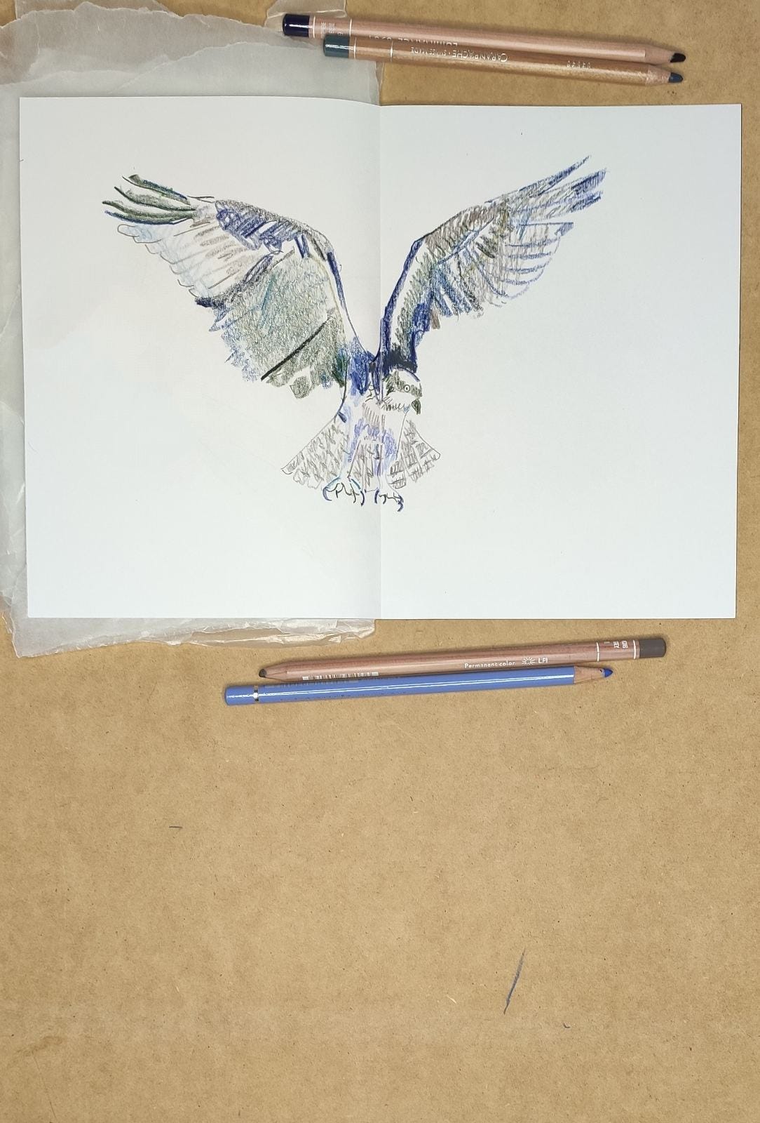
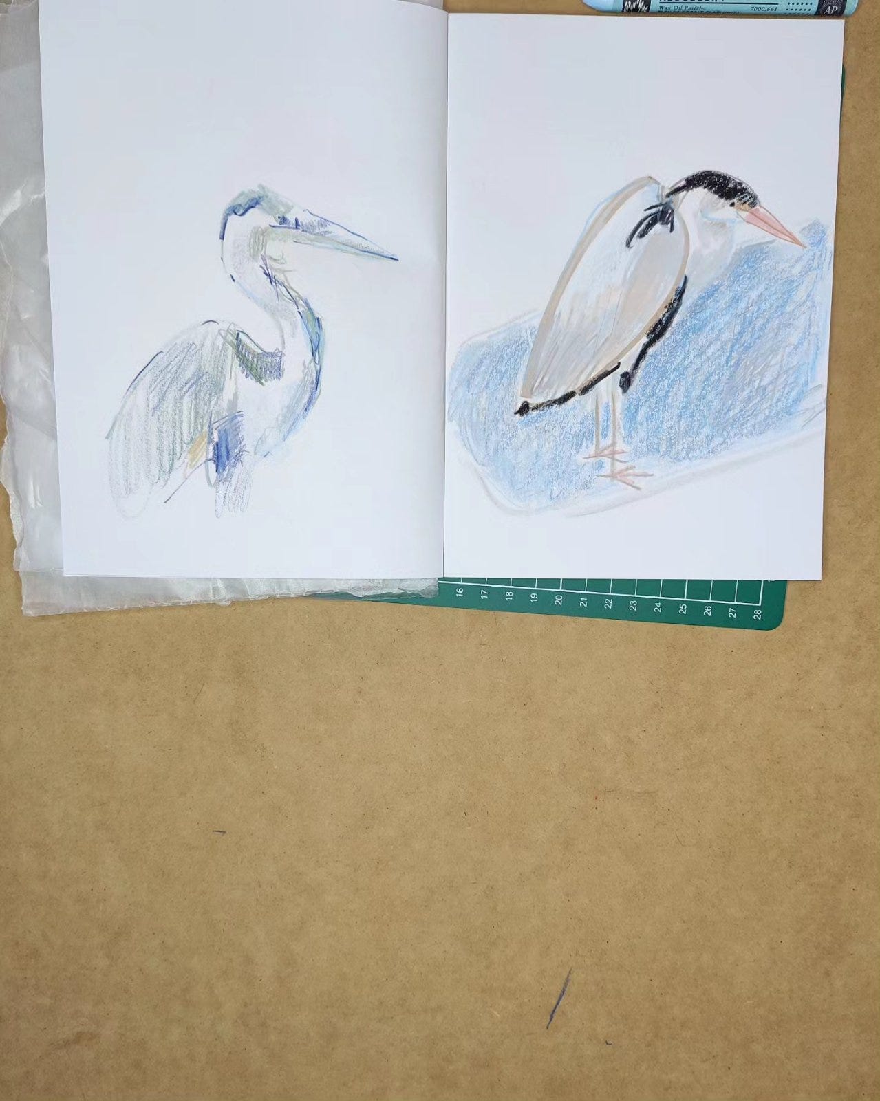
Art Process: My August Bird & Animal-themed sketchbook
Hello once again,
This month felt like I was addressing the last urgent area I needed to touch base with before I wanted to proceed with my original work again.
The idea has been that my original work will be improved by this series of forays into uncommon areas whether material-based (watercolour paint) or subject-based (July’s figure drawing).
Which brings me to August’s sketchbook project: animal and birds. I am already well-versed in flora, so now it’s the turn of fauna! It was an interesting month in terms of sketching as I was constantly adapting, sketch by sketch, to wildly (literally) different anatomies.
I mean to say figure drawing is also hugely challenging, but I did feel I reached a certain point where I was more and more confident with the basic (human) form I was grappling with whereas this month there appeared to be so many variations to consider if you draw different animals and birds.
Of course, some animals or birds were easier than others but the drawings required focus and vigilance even when I felt it was going to be relatively straightforward. Even on days when I felt I had achieved some flow and produced several good sketches I could get caught out and produce a really bad, off-scale sketch in a way that isn’t usual for me. You’ve got to keep your wits about you with this category of drawing!
But this has been one of my most enjoyable months of experiment and expansion so far and from here I feel ready to move into my next phase which will be all about producing original pieces on paper (to begin) and from there eventually on canvas more and more.
Above and below you will see a couple of sketches of birds from my August project. Expect to see more birds and also pictures of animals in my posts and newsletters in the future.
II
Process Notes: On Short Term Sketchbooks
Regarding sketchbook projects, one thing I’ve learnt is that short term works best for me.
I like to try new things but I also like to change things up as much as possible to keep my inspiration fresh and so I prefer monthly projects and additionally I have learnt instinctively and sometimes unconsciously to search out smaller sketchbooks so they are fit to (short term) purpose.
I think the essence of my art practise is something close to childhood play. It is about testing and experiments, trying new combinations. For that reason I am unlikely to promote absolute favourites of anything although I do have fluctuating current favourites. My art practise is about constantly trying new things, expanding my repertoire, and learning new skills along the way!
III
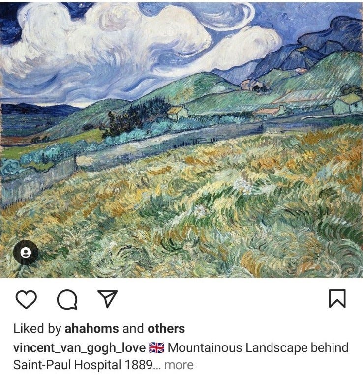
Art Objects: “Mountainous Landscape Behind Saint-Paul Hospital,” Vincent Van Gogh, 1889, Oil on Canvas.
This month the review is de-constructed into bullet points again as I have enjoyed presenting a reading in points in the last few months:
· The subject of grass or grasslands is one I love personally. You might even argue that close studies of grass is a relatively under-explored element of the natural landscape as an art subject for the general artist. I enjoy (sometimes) unpromising or apparently featureless scenes (or references) as they encourage you to really observe and see patterns and textures. And if there was an artist that had the knack of transforming the quotidian into artistic gold (literally) it was Vincent Van Gogh. And he paints grass quite often in his work and is one of the key artists (see also Durer) who really observes it and renders it as complex and alive and elemental in itself.
· Note the painting’s title: “Mountainous Landscape Behind Saint-Paul Hospital.” This is not just a landscape painting or at least it might be argued that we are encouraged to view the presented scene as literally adjacent to the life of the artist that produced it as the title allows us to see it in the context of a moment or period in Van Gogh’s life. This is the landscape behind the hospital where the artist-patient resided for a time. And so it is open to being read, as is so often the case in Van Gogh’s paintings, as both a biographical and psychological landscape painting.
· It might be contended that the mountainous landscape referred to in the title of this painting really refers to the background of the painting. But what of the grassy foreground? When the foreground is taken into account this painting might be viewed additionally as a “study” of grass, or of a pasture. The emphasis the title places is perhaps slightly misleading. Yes: the pasture is part of the landscape but is it also part of the grounds of the hospital as it is walled-off from the rest of the landscape. At least half of the painting is “something else” not mentioned in the title. Something unsaid which is itself expressive perhaps also of something else unsaid (see the next point). Finding the demarcation point between how this painting presents itself and what it actually is in terms of its own pictorial emphases is as tricky as finding the blue-grey (touched with Naples Yellow) wall between the foreground pasture and its backdrop.
· So what else is unsaid or unspoken or merely expressed in the foreground of this painting. What we have of course is Van Gogh’s signature highly-expressive and often impasto (to varying extents) brushwork and a depiction of a disorientatingly undulating terrain. There is a little of this in the picture’s sky too but it is found in its most expressive form in the foreground. As the mountainy middleground is relatively sedate in terms of coloration and brushwork. So here we have a painting that presents itself via its title as a conventional landscape but which in fact presents a scene with a foreground strongly affected by the psychological turmoil that necessitated Van Gogh’s residence in the hospital mentioned in the painting’s title. And perhaps it could be argued that the division in the artist and in his view of things in this period is presented or mapped out in the divisions in this painting. And so although there is a reaching towards the practise of producing something that might be considered a conventional landscape (as expressed more or less in the background), the pasture of the foreground is preoccupied with expressing something else, something that reaches towards abstraction in the wild patterns created in the sometimes vibrant and sometimes muted yellows greys and greens of the pasture grass.
IV
Art Adjacent: On Newsletter Labels
I have now completed a year’s worth of Art Letters, all named after months in the year, and so I feel going forward that I might want to change things up and give each month’s newsletter a theme or subject-based descriptive name so that each newsletter will be absolutely unique.
And so to inaugurate this new approach I am adding a new feature to each newsletter for the next twelve months where I consider and discuss a different colour or different colours either in relation to my own work or more generally and so what would be September Letter (Part Deux!) is now instead the “Black and White Letter.”
V
Art Adjacent II: On Black and White
I thought I would begin this new feature of the newsletter going forward with two fundamentals: black and white.
I shall be detailing my own thoughts and experiences relating to each colour or colours I touch on each month so let me preface this section by confessing that for the most part I avoid both of these “colours” (if they can be called colours) in my artwork.
Or perhaps not entirely, but mostly. I like to use colour, often vibrantly, and I like to draw in colour and so I never produce black and white drawings or pictures. And when I use dark tones I don’t favour black too often although there are certain blacks I do like occasionally in a limited way. More often than not I will use dark blue or green or purple instead when I am drawing. I might use black as a mixing colour when I paint but that would be the extent of it most of the time.
I do use white in one sense in my drawings – I use the white of the page quite often. Otherwise when I paint I do use white but find it a crude instrument. Of course tints might appear to be pivotal in certain types of paintings. But they don’t always have to be white. And when I have used white to create tints they often disappoint me.
Beyond that I actually do like a pastel shade now and then (and have purchased pastel shades ready made now and then) but usually I appreciate them in other artists’ work. Thus far I haven’t explored that so much in my own work (besides in some dry media pieces perhaps).
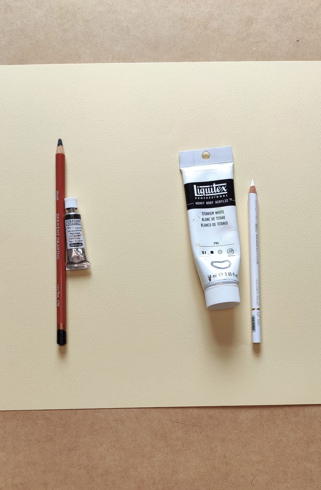
Of the blacks I own I would say my favourite is probably my Derwent Drawing Ivory Black Pencil, but I have only used it a few times! Nevertheless I like it because I can imagine finding a use for it whereas with many other blacks I can’t. I suppose I like a warm black like Ivory Black or even Mars black (of which I own a very nice gouache) possibly because I find warm greys quite expressive. Of course cold greys are expressive too in a different way but when I am confronted with dark tones I, for whatever reason, tend to like them on the warmer spectrum.
Of the whites I own do I even have a favourite? Well Titanium White is a good opaque white if that’s what you want whereas Zinc White lacks opacity and is more suitable for a glaze. They both have their uses. And in fact a white glaze can be an interesting “effect” in certain instances.
I wont’ be absolutist about anything regarding this topic as I have frequently “re-discovered” certain colours that I had previously undervalued. In the future I can imagine that Ivory Black Derwent pencil and that Mars Black gouache might become something I use a little more in my work.
I would be interested in hearing other people’s thoughts on these two fundamentals. I can imagine some artists can’t function without them or have them at the centre of their practise.
But equally I know of several artists who don’t use white in their work (particularly white paint) and I can think of one very famous contemporary painter who doesn’t use white at all in his paintings (or claims not to).
Are they crude instruments or unavoidable essentials?
VI
A reminder to check out my website shop at davidmonteiroart.com. Or follow the link in my instagram bio. I have a good number of prints available – some landscape, some botanic, a small few focused on animals and birds. Details of my printer supplier is featured with each listing.
UK and EU deliveries are custom free.
Also please do check out the small (but slowly increasing) collection of originals I’ve been adding to my website store over the last few weeks.
And if you are interested in pictures not currently listed I can add them to the store and you will receive them at the same rates as the ones already listed.
VI
This newsletter will continue on a monthly basis.
In the meantime if you are reading regularly I would ask that you would please consider subscribing to this monthly newsletter and if you would also consider buying me a coffee on Ko-fi at this link (https://ko-fi.com/davidmonteiro) it would be much appreciated so I can evolve and develop my practise. Many thanks.