


Blackberry Letter:
On my ideal sketchbook, on Pablo Picasso’s Rose Period painting “Famiglia di Saltimbanchi,” on recent sketches, on the colour “Blackberry,” and its variants.
I
Art Process: On my Ideal Sketchbook
Hello once again, so last month, despite an intention to continue with my original pieces on paper I got sidetracked into focusing on filling up a sketchbook.
I say sidetracked but quite honestly I was suffering a little from monthly project fatigue and welcomed the opportunity to just play a little without a consistent theme or thread running through the pictures I produced.
As I was inadvertently led down this pathway I thought I’d take the opportunity to discuss some of my thoughts re: sketchbooks. I have been using sketchbooks regularly since around 2021 I would say and in my time have used a variety of types and sizes.
The sketchbook for September was the Royal Talens Art Creation one that is so popular, an A4 one. I don’t know if anyone else likes to almost box tick re: materials but I have about five or six sketchbooks of different sizes and brands I bought in the last year or so that I almost feel compelled to use or use up, partially because I own and purchased them, but also because I am always curious about trying new formats and papers. So, for instance, I also have two Piths (one landscape and one portrait) and a Stonehenge one to try at some stage in the near future amongst others.
In the case of this current sketchbook I can’t even make the excuse that I hadn’t tried it before, I just simply bought one more because it had a different colour cover (pink in this case)!
For the sake of simplicity let’s take this current sketchbook as a case study and a way of discussing what I have gradually discovered I do and don’t want in a sketchbook.
When I was starting back into art again a few years ago, after a long break, I envisioned using large sketchbooks for the most part for some reason. But in fact I have discovered that I prefer smaller sketchbooks in practice and would say that my ideal size for a sketchbook is probably A5.
I just find A5, in either portrait or landscape format, to be very user-friendly, portable and economical re: materials. So although this current sketchbook (whose A4 format more often than not translated into A3 when I did a sketchbook spread) was freeing I hankered all the time for something A5. For whatever reason I find my work is sharper and more focused in smaller sketchbook format. Although, of course, working large on paper and canvas remains the preference outside the realm of sketchbooks.
My most-used sketchbooks are the A5 Hahnemuhle Sketch and Note books that are in fact a halfway house between a sketchbook and notebook. They suit the way I like to work in many ways not least because they have a small number of pages. I tend to prefer short form sketchbooks as I tend to go with themes book by book, and I like to change subject every few weeks.
But even these established workhorses don’t agree with all of my preferences. The paper quality, for instance, although surprisingly robust, isn’t quite what I would ideally want for completely unrestrained mixed media work. But for dry media they are more than adequate.
In contrast, the Art Creation sketchbooks are generally good for mixed-media. Granted you can push them too far and they will buckle slightly if you attempt wet-on-wet watercolour effects. This doesn’t bother me too much but what sometimes bothers me slightly is the off-white, creamy colour of the pages. In certain sketches this can be nice, but for the most part I prefer the whiter pages of the Sketch and Note books.
But neither these sketchbooks nor the Art Creation satisfy my last criteria for a sketchbook - over time I’ve found myself really hankering more and more for a properly lay-flat sketchbook for scanning/photographing etc purposes. Jackson’s do one but again the paper has its limits when it comes to mixed media work. I have also tried a Fabriano ring-bound sketchbook that lay flat but I would prefer to avoid ring bound sketchbooks too if possible.
So from practice I’ve learnt that my ideal sketchbook would be: a stitch-bound, lay-flat, A5, short-form, white-paged sketchbook with good quality paper that can endure mixed media. Quite a lot to ask I realise!
I have some leads I shall continue to follow - some already bought - as I have now finished the “September” Art Creation sketchbook and am ready for the next experiment. Any recommendations on other suitable or notable sketchbooks would be welcome!
II
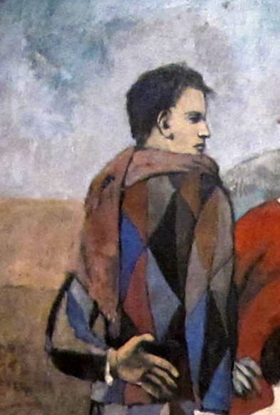
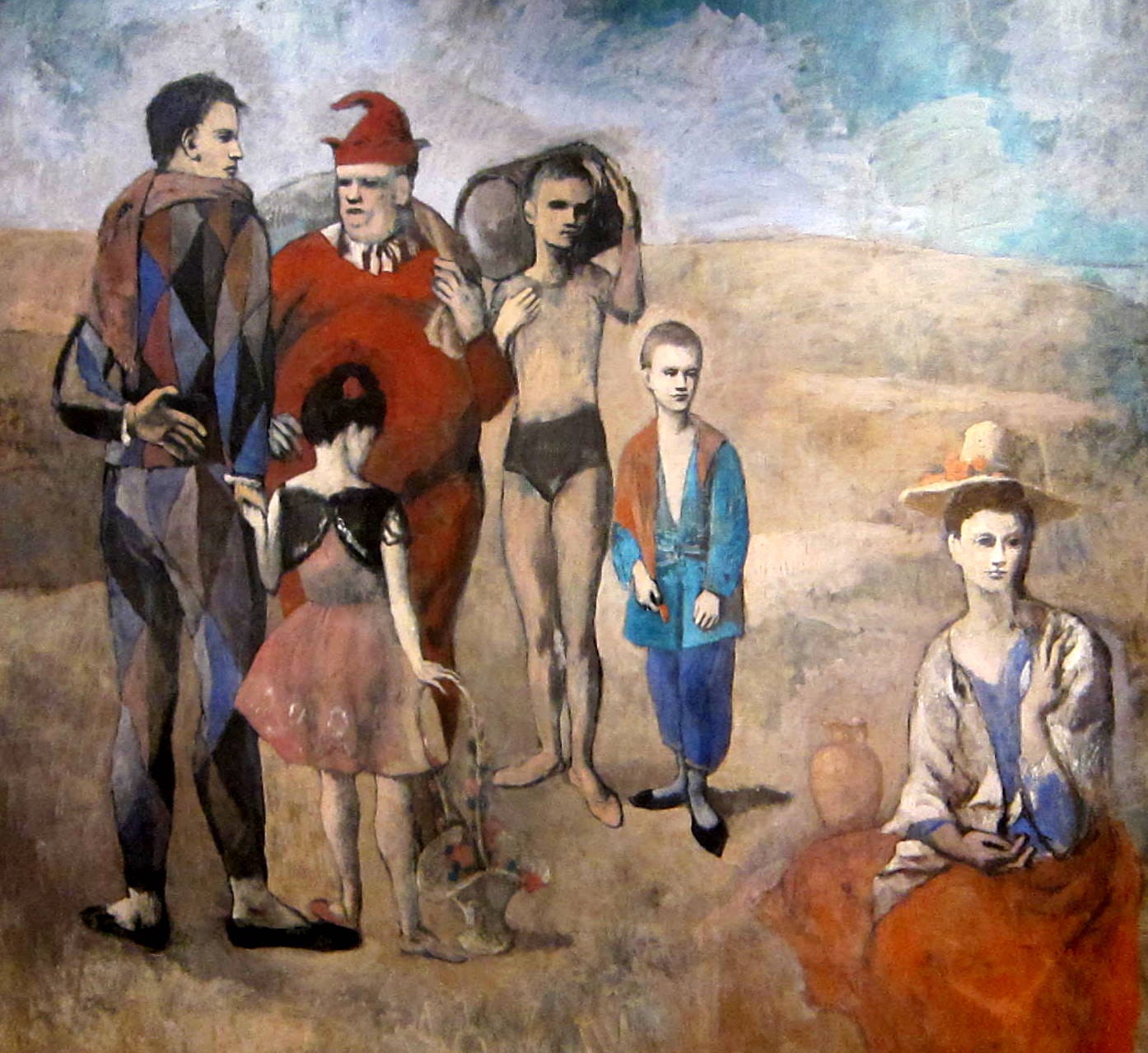
Art Objects: “Famiglia di Saltimbanchi,” by Pablo Picasso, 1905, Oil on Canvas.
This month the review is de-constructed into bullet points again as I liked presenting a reading in points last month:
· So, The Rose Period (or Circus period) is possibly my favourite phase of Pablo Picasso’s inexhaustible career. It has to do with a number of elements all of which are represented in arguably the key painting from this era: “Famiglia di Saltimbanchi,” or “The Family of Saltimbanques,” a saltimbanque being a circus performer in a travelling troupe.
The painting is a study of six portraits placed together in a vague, desert landscape. And in this brief enquiry I want to consider this arrangement of figures and the space they occupy as both are curious in innumerable ways.
Firstly, the figures. This is a very disparate group or “family.” And it is worth considering that by family Picasso most likely means company or group. And by this he is referring to the fellow-feeling many artists of various stripes feel amongst each other. This was certainly true of Picasso and the world of circus performers and of many other artists in multiple contexts not least the context of Spain in this period. In a sense he is referring to the outsider identity many artists feel they occupy when they step into this unique category.
So here we have a group of fringe performers. And they are all very different, in terms of size, colouring, style or rendering and character. In fact the painting has almost the feeling of a collage of disparate elements. It is not naturalistic as in some ways the figures might even be viewed as artist refugees from polite society but also refugees from different works of art all painted in different styles from different periods. And perhaps by this cut-up approach Picasso is suggesting that all artists from all periods throughout history and in multiple styles share this fellowship.
And amongst this group is a harlequin in grey-blue tones (perhaps a refugee from Picasso’s own preceding Blue Period) who is generally agreed to be a representation of Picasso himself. And for this reason my reading of “Famiglia di Saltimbanchi” is that it is best-viewed as a high-concept and playful self-portrait.
According to this reading Picasso is the principle figure in this grouping and the other figures might be viewed as a representation of the disparate personages who occupy the demi-monde of the contemporary artistic milieu or/and they might be viewed as stylistic motifs that refer back to the history of artistic predecessors Picasso claimed as his artistic “family.”
The setting of this painting is a void of character and nondescript as a stage set. Which in itself supports the artificiality and theatricality of this high-concept painting’s conceit: that this is a portrait of Picasso in the timeless and placeless hinterland of art where he finds company with artistic forbears and contemporaries.
The preceding Blue Period informs this Rose Period painting in that Picasso’s sad clown is dressed in a blue motley. Perhaps it is implied he has found this brighter phase, and a way out of the darkness of the Blue Period through comradeship and finding comfort in the work of artistic forbears. Blue and red are echoes in the dress across all six figures - in that respect this piece is transitional or hybrid. And those colours are echoes in the landscape of soft blue sky and pink-grey (or rose) coloured desert.
This might be the desert in the sense of a trans-historical space where there is communication between artists of every era (which in any good artist’s work often occurs in the artificial nowhere “zone” of each scrap of paper or canvas). Or it might be the desert every artist who identifies as outsider occupies.
III
Art Process: Recent Sketches & Artistic Comfort Zones
I think these two sketches illustrate a very loose dry media style of landscape drawing I’ve been showcasing this year, especially in recent months. Dry media is always the mode I fall back into when I need to re-charge myself or re-orientate.
I think it is good to have established artistic comfort zones. It can be hard to try new things all the time or test and challenge yourself with every new piece and so I don’t burn out and begin to avoid the rigours of perpetual experimentation I do have phases where I retreat a little into more comfortable areas which for me is in my origins as a dry media, sometimes mixed media artist. Simple, immediate sketches act as little sideline doodlings or pictorial musing. In fact, one of the greatest discoveries I’ve made in the last few years is that just drawing, without a project and purpose, calms and soothes me to the extent that sometimes I feel need to go home and draw for a while just to reset.
IV
Art Adjacent II: On the colour “Blackberry”
I have never loved purple nor used it much in my work until fairly recently and even now I have a relatively limited use for it.
But as a consequence of discovering a range of art materials named after various berries, but particularly the likes of Blackberry or Blackcurrant or Black Cherry I have developed a liking for a version of what some might loosely term a purplish colour, although it would more accurately need to be viewed as a dark tone, mostly blue at base with a hint a red in it: a lush, deep colour.
I will qualify: this is not a cold, deadened Imperial, Royal or Papal purple. This is a dark but vibrant colour. And although I may never have a use for a pomp and pageantry style of purple in the future (although you never know) I am loving these berry derived colours as my ”darks” or shadows in recent pictures (depending on the picture). They bring something more interesting than black for instance and something more distinctive than even a blue-toned grey.
In spirit with these food-named purples I see that Caran D’Ache Luminance has some Aubergine-themed purples that I might investigate in the future. Anyone tried them? Any thoughts on whether they’re worth a try?
VI
A reminder to check out my website shop at davidmonteiroart.com. Or follow the link in my instagram bio. I have a good number of prints available – some landscape, some botanic, a small few focused on animals and birds. Details of my printer supplier is featured with each listing.
UK and EU deliveries are custom free.
Also please do check out the small (but slowly increasing) collection of originals I’ve been adding to my website store over the last few weeks.
And if you are interested in pictures not currently listed I can add them to the store and you will receive them at the same rates as the ones already listed.
VI
This newsletter will continue on a monthly basis.
In the meantime if you are reading regularly I would ask that you would please consider subscribing to this monthly newsletter and if you would also consider buying me a coffee on Ko-fi at this link (https://ko-fi.com/davidmonteiro) it would be much appreciated so I can evolve and develop my practise. Many thanks.