


Chartreuse Letter:
On painting originals on paper, on spring time in the glass house, on my gouache colour palette, on “Green Deer Grazing,” a mixed media sketch, & on chartreuse.

I
Art Process: On painting originals on paper

Two observations regarding my recent paintings on paper.
A: On the difference between a drawing and a painting. I listened to an interview with Andrew Cranston recently and he talked about how long a painting can take him - years in certain cases! And I was thinking of other artists I am aware of who laboured over their paintings for a very long time - artists like Graham Sutherland and Lucian Freud (whom David Hockney noted took a much longer time to complete a portrait of Hockney than Hockney did to complete his portrait of Freud).
And I am thinking now that my few pictures on canvas have tended to take longer than anything else I’ve ever produced.
But my paintings on paper are another story. So far, they’ve been completed quite fast and I think I know why more or less. For one thing I have been immersed in sketchbooks the last few years and I am used to experimenting and diving head first into each piece/spread. There is no hesitation and I like to proceed quickly and that has put me in good standing regarding my works on paper.
Additonally I feel that although I am now working on mixed media “paintings” I am schooled in the informality of the “drawing” and that affects my approach and attitude. The fact I am still working on paper, although outside the context of the sketchbook, is another factor as I am still in the realm of the “drawing,” or at least adjacent to it.
B: I haven’t acquired a sense that these current pieces are the performance and that everything else I’ve done was a series of rehearsals.
I think I have a firm sense that every art piece, even finished “masterpieces” from established artists, might, in context be viewed as part of a continuum.
Every piece is a trial piece to some extent, which is not to demerit works of great distinction. As for my favourite artists I often find their sketches and sketchbooks as interesting as their “finished” pieces and stylistically I like loose, expressionistic types of work in any case.
Many art critics, for instance, have argued that Gustav Klimt’s drawings often surpass his sometimes overworked and over-ornate finished work so there is this sensibility in the art world, in certain cases, that prefers rehearsal room looseness to the taut poise of final performance, so I am finding I am not overly self-conscious or self-critical at this stage.
For me, at least, this foray into works on paper is itself another process of exploration and so I am happy to see where it might lead!
II
Process Notes: On Spring time in the Glass House
I discovered during my last visit to the Botanic gardens that late winter/early spring represents a unique blossoming time in the greenhouses.
Of courses the gardens themselves were neat and tended and naked, all discreet woodchip and manure, nascent, prepped, and waiting for what comes next but inside the glass houses it was very different.
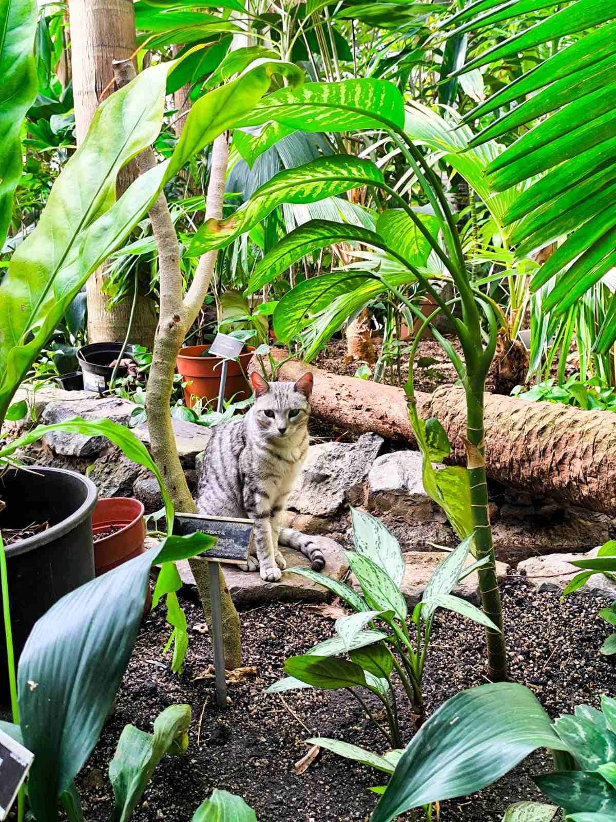
The main tropical house was just as you might expect, steaming, dark green and indifferent. Except for the small deviation of a greyish cat who had strayed inside one of the open windows (and who shall certainly inspire at least one drawing in the near future).
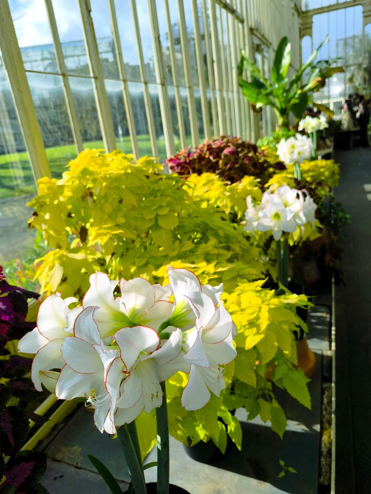
But in other, cooler houses, the fern house and Southern Hemisphere house (Australian, South African and South American floras) for instance, there was a blossoming I’d never witnessed before possibly on account of thinking this a bad time of year to visit.
But, as far as I could see, this was a time of great blossoming in these glass houses. Never before had I witnessed such a superabundance of flowers. Ranks and rows of pots and plants bursting with searing colour and vitality. This early spring period truly is the southern hemisphere botanic greenhouse’s secret summertime.
III On setting up a tiny gouache palette
I do, by now, love painting, but I’ve never really become obsessed with watercolour.
Certainly, I have lost my fear of it and am happy to use it in my mixed-media work and that is probably enough for now. Consequently I only possess one watercolour palette of 14 colours - from the wonderful company Kremer - and have only filled up the empty middle row with random colours (mostly greens and greys) from assorted brands. So I am content to keep it fairly simple re: my watercolour supplies. One palette with about 22 colours altogether suffices, and I can imagine that will last me for years to come!
Additionally, I never really caught the palette bug because I don’t tend to enjoy painting outdoors. Sorry, I just can’t! Can’t do it. I take photographs and assemble compositions at home. I am too self-conscious and too easily distracted and too intent on enjoying walks and company when I am out to settle down and just paint for any significant amount of time. So really I felt multiple palettes in my case was an unnecessary indulgence.
Which brings me to my new palette which is a recent little experiment which has, needless to say, nothing to do with any en plein air plans! In fact, because of my unique circumstances of having moved into a new house in the last year this palette has been created to facilitate the challenges of painting indoors when your art materials are scattered around a house.
Since I’ve moved in it has been a long disorientation and there has been a glacial gathering together of packed away materials. And as I realised that having a large portion of my art materials pocketed away in inaccessible places was hindering my art process and creativity and as it is springtime I’ve been recovering lost art artefacts from cardboard boxes in the attic.
So in a way this little palette is emblematic of this new springtime process where I refresh and re-set how things are laid out and prepared so work can happen. My art cart has been brought downstairs and re-filled with favourite materials. And I wanted to have things ready to hand and ready to go and so I thought instead of burrowing through paint boxes perhaps I would use my gouache paint collection more often if some key colours were enshrined in a little palette.
The colours I chose are as follows: First Row: Sennelier Light Green (which is actually dark for some reason), Sennelier Emerald Green, Winsor and Newton Oxide of Chromium, W&N Cyprus Green, W&N Lemon Yellow, W&N Naples Yellow. Second Row: W&N Phthalo Blue, W&N Burnt Umber, W&N Permanent Rose, W&N Dark Naples Yellow, W&N Grey, W&N White. The only one of those twelve I’m not satisfied with is white, which I included partially as an experiment and partially because I was determined to choose the twelve most lightfast colours I possessed!
In any case as I want to work fairly consistently and uninterruptedly on paper in this period I wanted some ready to grab materials on hand as delving through boxes is enough to kill the desire to paint before it evolves! And so with (two) palettes on side, brushes and pencils arranged in jars and tins, I shall hope to embrace this springtime creatively.
How this will work we shall see. Half of the colours in this new palette still look glossy and faintly wet whilst the others are slightly grainy and cracked. We shall see!
IV
Originals Coming Soon!
I will be periodically showcasing small amounts of originals (five maximum) on Big Cartel, available via my bio in instagram (as part of my linktree) & here: Shop.
I’ve been thinking about whether and how I might want to use Big Cartel going forward for some time. I want a separate space for originals (away from prints and sketchbook pieces) where I can display them in small groups from time to time.
Big Cartel is a shop in essence, of course, but really I wanted a separate venue for originals so that they can be viewed as they appear as little showcases of current styles and interests. They will be listed unpriced for now - think of it as a miniature informal exhibition space for the moment!
Some originals will still be showcased on my website, if only to demonstrate that aspect of my work there too.
V
Art Objects: “Green Deer Grazing,” a sketch in dry media.
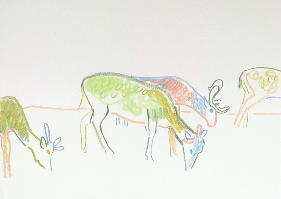
This drawing is a part of a series of sketches I did of Phoenix Park deer. In almost every walk Guio and I go on we encounter them, grazing, passing through, or standing in herds at a far distance or at a nearer and careful distance. Although it would be untrue to say they are afraid of humans! Some people feed them and some bolder deer graze quite close to the assigned paths or even race through populated areas and across paths, springing almost as they run.
These deer sketchbook pieces are all A5 - one of my favourite sizes for quick sketches. When I began sketching I always envisaged sketching at a grand scale for every piece but in practise I have found I quite like smaller, more intimate sketches. They are quick to do and can have an immediacy to them as a result.
This is a mixed media sketch in dry media - which means colouring pencils (various brands) and artist-grade crayons (neocolours). These are probably two of my favourite dry media to use for sketching, although I do go through phases using markers too. Some of my most ambitious sketches include a mixture of all three, or incorporate paint too. I have discovered over the last two years that I really like mixing media as much as possible when drawing. It keeps each sketch fresh and interesting.
I am very much someone who draws from observation more than from imagination. This sketch, for instance, was based off one of many photographs I took whilst strolling in the park. But I did notice that I learnt the “trick” of drawing deer in this period and experimented with a few imaginative sketches, and some of them were decent enough. Perhaps it was because I drew them so much or perhaps deer are just one of the easier animals to draw!
VI
Art Adjacent: On Chartreuse

I can’t decide if chartreuse is an underripe or overripe colour. Possibly the former.
In any case it is certainly, appropriately for this April newsletter, a springtime colour, whether it veers towards yellow or green.
This is the tart, almost sour, eye-searingly sharp yellow green of the newest, freshest, youngest leaves, buds and grasses that sprout all around us (in the northern hemisphere that is) this time of year.
And a little of this colour, the colour of burgeoning grasses and spring greens, goes a long way on a page. You only need a dab to make an impression, and too much is much too much.
It’s apt perhaps that this colour is inspired by a liqueur as it is rich heady stuff. I feel certain potent colours (like last month’s dark cadmium yellow) should be used sparingly (depending on your aesthetic) as they are high impact even in small amounts.

VII
A reminder to check out my now active print shop at davidmonteiroart.com. Or follow the link in my instagram bio. I have a good number of prints available – some landscape, some botanic, a small few focused on animals and birds. Details of my printer supplier is featured with each listing.
UK and EU deliveries are custom free.
VIII
This newsletter will continue on a monthly basis.
In the meantime if you are reading regularly I would ask that you would please consider liking and subscribing as this will support my artistic endeavours more generally. And if you would also consider buying me a coffee on Ko-fi at this link (https://ko-fi.com/davidmonteiro) it would be much appreciated so I can evolve and develop my practise. Many thanks.