


Colour Mixing Letter
On colour mixing, recent sketchbook work and a side-by-side consideration of Neoart pastels and Luminance pencils.

I
Art Process: On Colour Mixing
I find that when colour mixing “hacks” are presented they tend to be presented towards those who might be considered more conventional, figurative artists.
Most art advice you will find on the internet treads a fairly traditional path but that’s another discussion!
This month, I just wanted to briefly consider how colour mixing, and provide a slight amendment or counter-measure to the conventional advice on this subject.
I won’t deny the legitimacy of the colour wheel or the usefulness of the “tricks” or "short cuts” you discover along the way, or how nice a green black and yellow makes nor how nice a game it is to find an infinite spectrum of greys and browns from mixing (and re-mixing) the most unlikely colours.
But I will reiterate something that I tend to emphasise in different form over and over. To be an artist has to involve some degree of waywardness and the cultivation of an individual path in all things and every process connected to your art. Otherwise why be an artist!
And so this principle, to my mind, stands for colour mixing too. Think of the famous palettes of the past. John Singer Sargent’s frustration at the lack of black in Claude Monet’s palette and studio betrays more than a petty (art) material concern. It also denotes an aesthetic and temperamental divide.
Francis Bacon’s palette was, infamously, a caked mountain of congealed pigment and he is not alone in that respect if you observe many artists’ studios and their working methods. For those who choose to put aside their existing knowledge of colour theory, for expressionists, for experimenters, colour mixing can often be a dirty, sometimes muddy, alchemical, intuitive, chaotic business.
And so, in light of that, perhaps the best advice is to know the rules, learn your own trial-by-error tricks, and choose what you apply in any project according to what you deem appropriate. Which may involve breaking “rules”, or inventing some, along the way. In any case you will always be your best teacher.
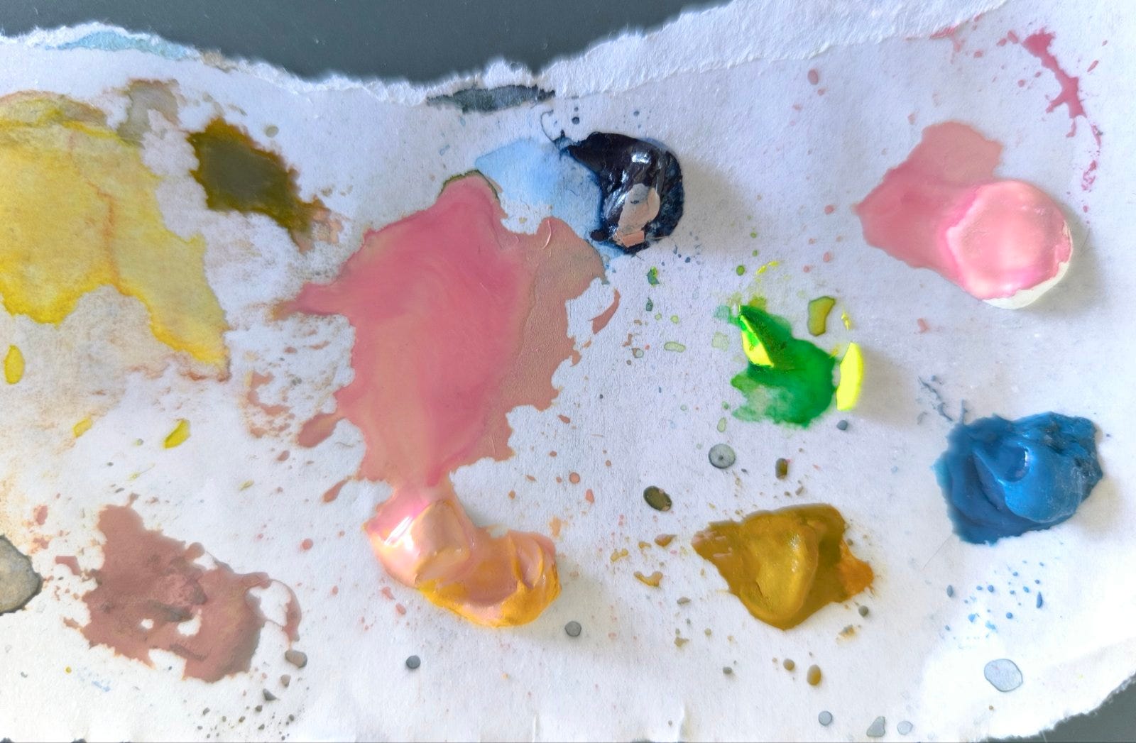
Working in mixed media can be instructive as colour mixing becomes in some respects just another facet of mark making. You are dealing with mixable paint on one hand and then dry media which is more fixed but at the same time can be blended or shaded or smudged or laid down in faint, barely perceptible layers. All of this is “mixing” of a kind.
When dealing with watercolour you are not only dealing with “colour” pure and simple but also with how opaque or transparent the colour is which of course will read differently when read as a colour. That is another form of mixing.
The great sin in colour mixing when following more traditional models is to mix “muddy” colours. And yet just as there may be balancing elements of tonality in a piece, of light and dark, and of warmth and cool, etc, the muddy, muted end of the spectrum can form a striking contrast with more vibrant notes. I don’t want to conflate accidental muddiness with deliberate mutedness as such, as it can be argued that there are purer forms or mixes of muted colours, or let’s say straighter paths towards mutedness, but on the other hand I do want to champion waywardness and experiment.
After all, playing with all the possibilities and available “settings” of your palette, however you like, even if they are conventionally frowned upon, is absolutely in spirit with those pioneers who discovered all the palette “hacks’ that have become contemporary colour mixing gospel truths.
II
Recent sketchbook work
I have been working directly on paper most recently but I have worked in sketchbooks this year up to quite recently (April to be precise) so here is where I left off with percolating processes and whatnot.
Both of these pieces were shared on instagram recently. They are both mixed dry media with particular and distinct emphases and I thought I might outline a little of their background, process-wise.
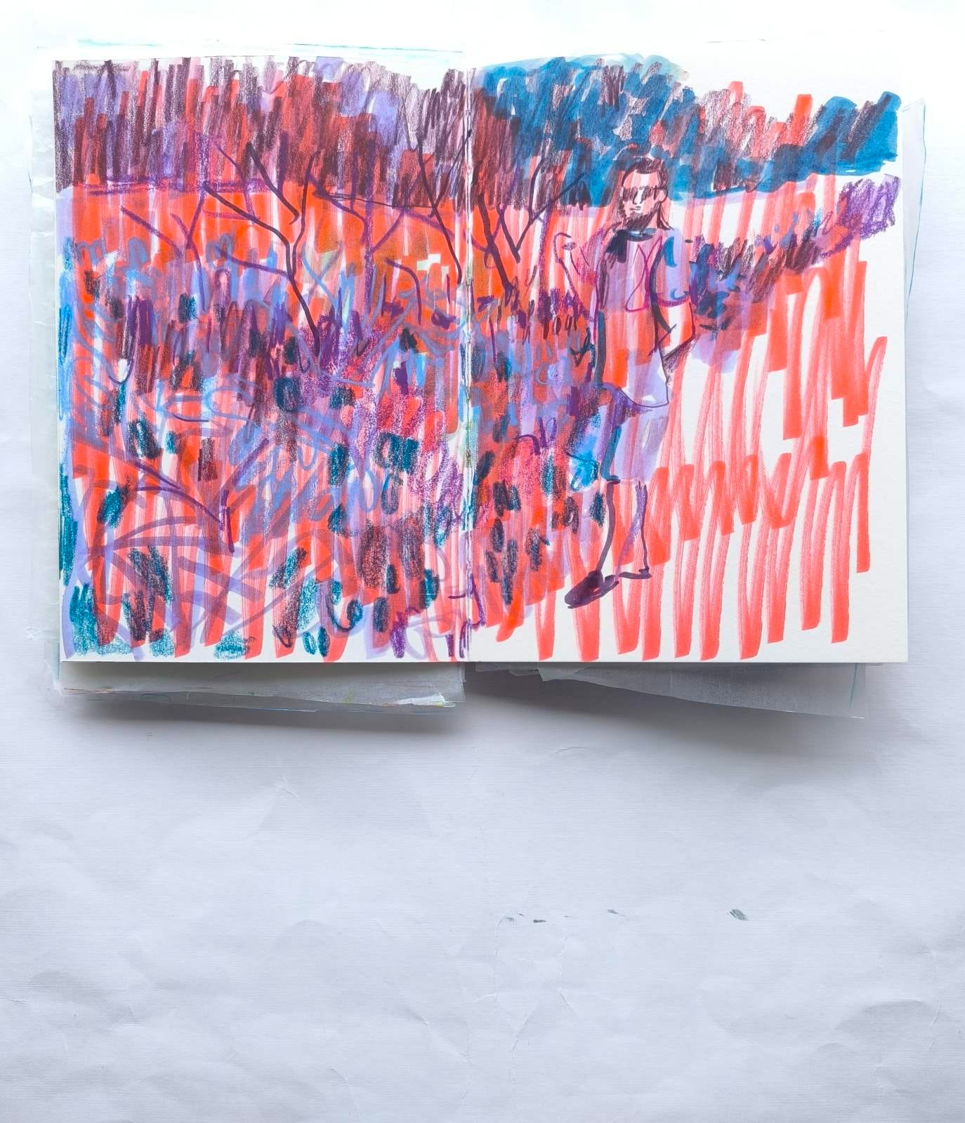
This first one is mixed media with an emphasis on markers.
I love markers unashamedly and will talk more about them at another time as part of this year of considering art materials, although I will say this, although they have a strong presence in illustration, I feel they are underestimated as a medium elsewhere.
This is a style I haven’t showcased much of (as my work, especially my watercolours tend to be muted) but I love this hyper-vibrancy too. There is a place for both.
As a side note as I discussed colour mixing above I’ll reiterate here that colour mixing does occur in dry media pieces too. Some of this is achieved by layering and blending of course and some is achieved by the eye.
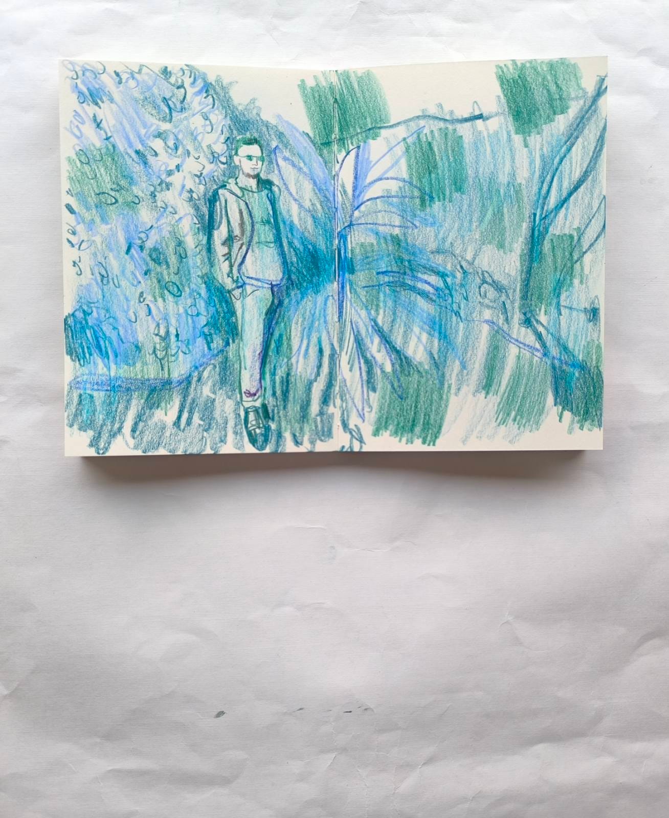
This second sketch is mixed media with an emphasis on coloured pencils.
Another garden-scape, my preferred locale, alongside sundry scenes of hothouses.
This is a return to my more typical muted style of late.
What might be more unusual is that here the scene is distorted as though the image has warped in a fashion.
This is deliberate. To anticipate a little, I might write more on this approach again: distortions that might be detected in my recent work is connected to a style I am exploring.
III
Process Notes: Neoart Pastels and Luminance Pencils considered side by side
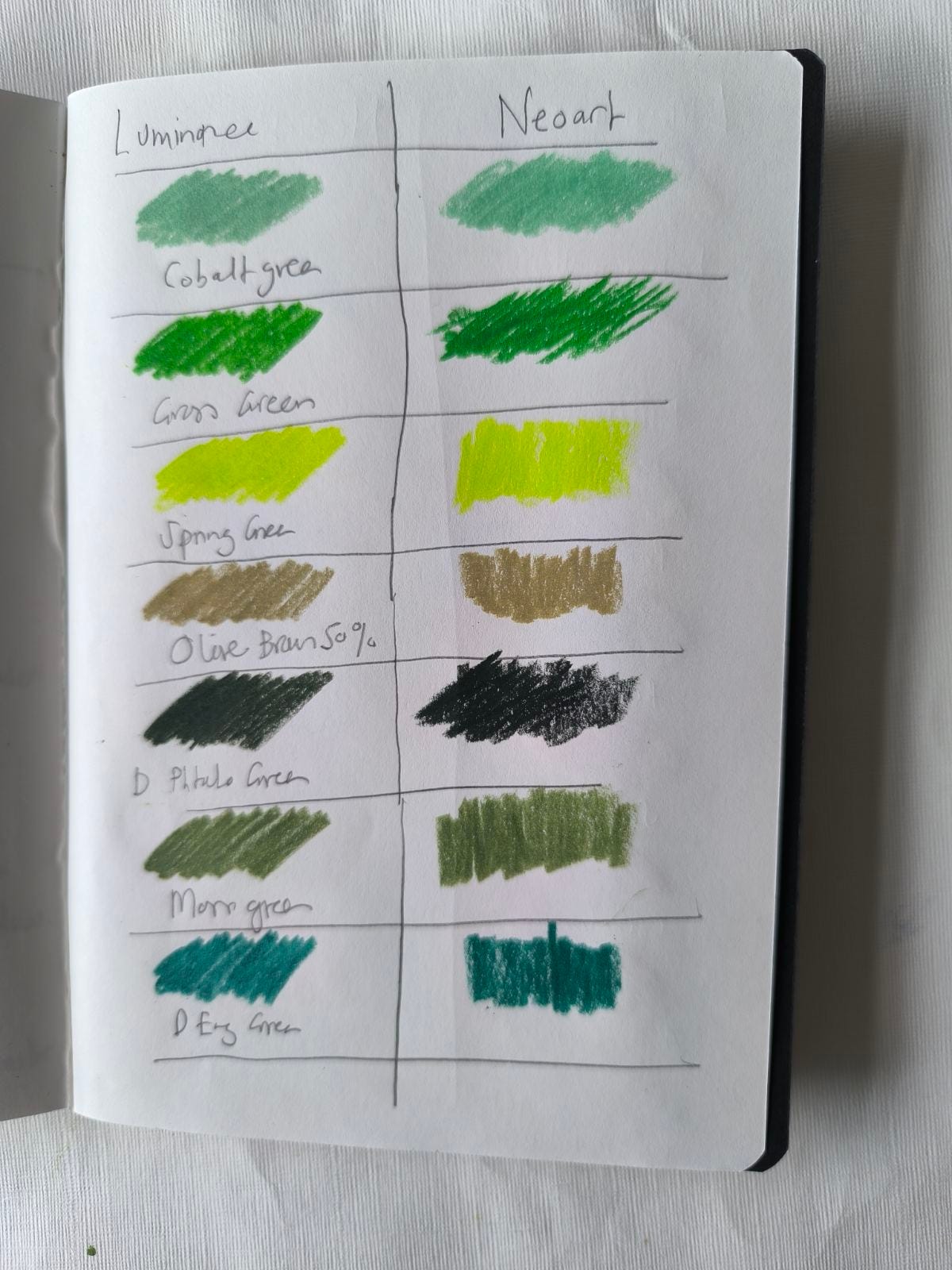
As this month I am discussing colour I thought I might add some follow-up thoughts on the Caran D’Ache Neoart pastels, which I “reviewed” last month, most particularly in relation to their colour range and how it compares to the Luminance pencils.
As art folk do people are already speculating on whether and to what extent there might be a future expansion of the Neoart pastels.
I wonder about this as some of the formulations of their existing pastels are not exact matches with existing lines of colour (in this case the Neoart pastels are following the Luminance Pencil colour range), but I will get to why that might be an important consideration in a moment.
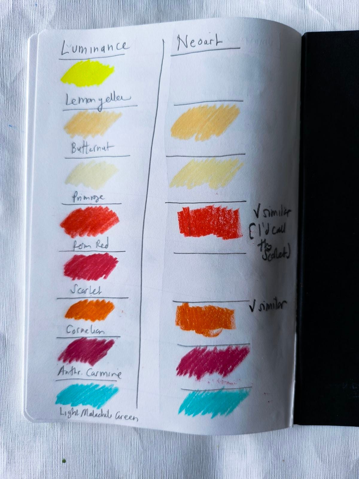
Firstly, I’d like to respond a little to the comparison swatching test I did of both mediums and reflect a little on the results.
From testing the ranges side by side, or what I possess of them, I found that most of the pastels are complete and exact matches with the Luminance pencils.
For instance, Manganese Violet, Dark Indigo, Permanent Red, Light Malachite Green, Burnt Ochre 10%, Perylene Brown, Dark English Green, Grass Green were all perfect matches with their Luminance equivalents as far as I could see.
Then there was a large category of colours where I felt the match was more or less exact but with a slight difference in consistency but not to the detriment of either pencil or pastel (mostly). In other words side by side they read as two very good slight variations although in most cases the pastel was arguably the slightly superior version.
The two Butternut colours were more or less exact matches but the pastel had an extra creaminess, ditto Primrose, Cornelian, Cobalt Green, Lime, Olive Brown 50%, Violet Grey, Violet Pink, and Light Cobalt Blue (5%).
In many of these cases the pencil colours just appeared to be more dilute when placed beside the pastel counterpart. Probably the worst example of this relative failing was in the Luminance Ultramarine. After seeing that contrast I can’t help but feel that the Ultramarine pencil (or my version of it) is quite thin gruel as a colour, at least in comparison to the pastel.
Then there are more or less matches with a slight differentiation of tone. With Dark Phtalo Green, Russet, Ice Blue and Burnt Sienna the pastels appear to be darker (with Burnt Sienna lets say much darker).
With Moss Green and Anthroquinone Carmine the pencils appear to be slightly lighter. Only very occasionally does the colour seem markedly different. The one instance I noted was that the Herculanean Pink in pastel form is less muted and more “fleshy” as a colour.
Whilst reviewing these colours I did note some random attributes of both media along the way. I have to say that the Luminance Lemon Yellow pencil truly is a wonderfully vibrant, almost neon colour. It’s a great yellow. And is it just me but should the Luminance Permanent Red and Scarlet reverse their names? The Permanent Red is to my mind a perfect red-orange whilst the official Scarlet is a perfect standard red.
Now, here’s where things get a bit tricky. As often as not in this comparison test I was matching pencil and pastel by referring to the code number on the barrels of each and in most case it was possible to find matching pairs. But not all colours are precisely matched in a clear cut way.
So, for instance, there is no clear cut match for the new Gold Cadmium Yellow Hue pastel. I swatched three Luminance pencils beside this colour: Medium Cadmium Yellow, Golden Bismuth Yellow and Indian Yellow and none of them were a precise match. Golden Bismuth Yellow was the closest and has a different barrel code. Which suggests to me that the Neoart range has some colours that attempt to “condense” aspects of the Luminance range.
So instead of providing a full range of yellows this tendency suggests that we might expect the range to provide one representative golden yellow colour, alongside the Lemon Yellow and the Yellow (which incidentally appears to match the Luminance Medium Cadmium Yellow and might be deemed the mid or standard yellow for the Neoart range).
Similarly, there is no immediately clear cut equivalent to the Neoart Night Blue in the Luminance range. I swatched Prussian Blue, Bleu de Nimes and Indanthrone Blue beside this blue and it matches the latter in my opinion although again they have different barrel numbers. Again Night Blue might be best seen (for now) as the Neoart range’s representative dark blue (not counting the black blue of Indigo) which might again indicate a future reluctance to expand the range with more dark blues.
Again, Neoart’s Ochre seems be a variation of both the Luminance range’s Yellow Ochre and Raw Sienna. It resembles the latter most closely but is even a little darker and not a precise match. Again this hybrid colour, a broadly representative all-purpose ochre, might be seen to suggest that the Neoart range intends to be less comprehensive than the Luminance colour range in its future expansions.
Another odd deviation I noted was that the Neoart Burnt Ochre matches the Luminance Burnt Ochre 50% and not the Burnt Ochre 100%, as you might expect. The Neoart range already includes some 50% and 10% colours but this inconsistency re: the Burnt Ochre might indicate a tendency towards eliding and rounding out colour options.
The Neoart Cobalt Blue 10% matches the Genuine Cobalt Blue and not the Mid Cobalt Blue as you might expect. Again, this suggests that every strength and dilution and variation of colour may not be included in expansions of this range if that ever happens.
These deviations suggest to me that even if there is a expansion of this range (and I expect there will be one) in the future we are unlikely to get a completely matching accompaniment to the Luminance pencil range as the existing Neoart range has hybrid colours that might be deemed convenient short cuts that already provide a summary overview of aspects of the Luminance range.
V
Originals
I will be periodically showcasing small amounts of originals (five maximum) on Big Cartel, accessible via my bio in instagram (as part of my linktree) & here: Shop.
And if you are interested in pictures not currently listed I can add them to the store.
VI
A reminder: if you have enjoyed any aspect of my monthly posts do consider liking, and subscribing to this newsletter. It would really mean a lot and help me maintain this space going forward