

Cotton Paper Letter:
On cotton paper, on messy materials, on a recent sketch.

I
Art Process: On Cotton Paper
After a year focused on a monthly “colour” theme I am now going to switch to thinking about materials for the next twelve months.
And this month I am going to consider cotton paper as I feel I have grappled with it in multiple different formats during my experiments with watercolour over the last while.
When I started to make moves in the direction of producing original work I didn’t immediately leap into attempting to paint on board or canvas. Possibly as a consequence of being accustomed to drawing or painting in sketchbooks my first and current transition has been onto artist-grade papers. And the supreme artist grade paper tends to be cotton, preferably 100%.
I have seen other artist discussions re: the anxieties involved in using “better” materials, such as their expensive sketchbooks. And the transition onto cotton paper feels similarly fraught. The feeling can be: this next sketch needs to be worth it, or this next sketch needs to work out. And I felt that and felt disappointed that every piece didn’t live up to my expectations.
But I have pressed on with this project and things have normalised in that respect. I feel less pressure - each piece is now, in my mind, a “trial piece” at the very least. And cotton paper is now one of “my materials”: a term I reserve for materials that are tried and tested. And testing is an integral part of the process as not all papers, or indeed cotton papers, are made equally.
Not all cotton papers, for instance, are the gold standard 100%. Which is fine and each has its place and purpose and use. And in fact a cotton blend paper can be a good place to start for those fearful of using “good materials”, and it is still a type of paper I use in finished work. It’s worth noting: a cotton blend paper will still tend to be one of the better papers if not the best. And it may well, depending on its make up, have other good qualities or advantages. So really what I would say is that each paper must be viewed on its merits - it’s good to fully research what a paper has designed for before purchasing as many have been crafted for very specific purposes.
One thing I wrongly assumed when I started testing out different papers was that a cotton paper would undoubtedly always be extremely robust no matter what. But no: I have discovered that paper weights still matter. I found, for instance, that even the Arches 185 gsm hot press paper buckled beyond redemption with too much water (I tend to use a lot). If I had known better I would have put that paper aside for dry media work, but I wouldn’t buy that weight again for painting no matter the brand or type of paper. I should say that I do know of some artists who do paint with this weight paper successfully - I can only say it doesn’t work for me. I don’t like the look of a finished piece at 185 gsm. To me, it doesn’t hold its integrity.
One other wrong assumption I held was that a transition into cotton papers was a transition into painting. And as I like to draw just as much as I like to paint I was happy to discover that hot press cotton paper or sometimes just low weight cotton paper can be wonderful to draw on. In fact, even if the paper is a cotton blend it can make for one of the best papers to draw on in dry or (slightly) wet mixed media.
In fact drawing on cotton paper feels very luxe and when a piece works out the quality of the paper only enhances and elevates the final result. And here’s the thing, the dilemma if you like, that hangs over a shift or transition into using more artist-grade materials. Yes, it can feel self-indulgent and wasteful if you are not getting on with the material or if the work isn’t developing in the way you’d hoped. But the flipside of this is that the best materials will also, in many ways, elevate your work. I have done enough tests by now where I have produced several versions of the same picture on different surfaces and a picture on poor quality paper will be diminished by that surface. It will buckle, it will warp, it will curl up and look flimsy and too delicate. None of which helps the final product. In fact, I would wager that many people’s negative experiences with watercolour have to do with using sub-par paper (and sub-par paint).
I would be interested in hearing others’ thoughts on cotton paper and on paper in general and on their process re: using different types and grades of paper in their work.
I am continuing to test and learn as I go and I only wish I’d known sooner about the materials I might have used in the past!
II
Process Notes:
On Messy Materials
I have realised quite recently that I gravitate very strongly away from the messier types of art materials.
This realisation has coincided with having finally understood which materials I tend to prefer and use most often. As a consequence of this I attempted to sell some of my less used materials in the last few months and ultimately made the connection - I wasn’t using these materials because in various ways I found them awkward or onerous to use.
What I now know I gravitate towards are materials which you can grab and use fairly easily with minimum fuss or mess - and so for me that would be my watercolours, my gouache, my coloured pencils, my crayons, and my acrylics and inks. Some may be surprised I include watercolours in that list as they can seem messy from a distance, although that might be related to how they create chaos on the page as opposed to on the desk (although that can happen too sometimes). But as a material they are hard to beat for immediacy and ease of use.
Oil paints have never been in the equation for me as I don’t like that they involve solvents/turpentine, and I don’t like their slow drying times. I also find the incessant wet on wet of painting with them frustrating.
But the materials I’ve been attempting to sell just recently are materials I respect and have used before and was curious about to some extent (otherwise I wouldn’t have bought them in the first place!), but which didn’t quite chime with the way I tend to operate. So recently, for instance, I sold a good supply of Sennelier oil pastels and still own (and am looking for a home for) some neopastels.
I did use (much cheaper) oil pastels as a student years ago and do enjoy (sometimes) the look of oil pastel work. To be honest I find it hit and miss as a medium although it does possess a unique look at its best. But although the Sennelier pastels where absolutely beautiful materials I just couldn’t warm to them or find a way to use them. Or to put it another way - I would have loved to use them if they acted a little more like art crayons (like neocolours for instance). I have produced work in oil pastel and neopastel recently that did not flourish in a sketchbook even behind glassine paper. The pieces in question smudged and smeared almost beyond redemption (to my eyes). I find that frustrating - as with oil paint there is the fuss of the slow or never drying pastels and how to keep the work intact and smudge-free. And then the uncertain alternative of using a fixative which may need to applied multiple times and with no guarantee of working absolutely. So I was happy to say goodbye to my Sennelier - for another artist they will be perfect.
Similarly, I love the effect of soft pastels in other artists’ work and the Unison pastel has always looked particularly tempting, as like the Sennelier oil pastels they are another beautifully-produced product with an unique and extensive colour range. And soft pastels do have wonderful coverage. But once again there was the smudge factor and the dust. The dust! Perhaps it’s because I had asthma in my younger years. Or perhaps I want zero-fuss, immediacy, and unfettered directness in my work practice. In either case, I couldn’t justify the probable wastefulness of trying out Unison.
Is this philistine of me? Or self-limiting? Possibly, but I do love texture and grain and try to produce as much of it as I can using pencil, crayon and paint. And I do realise that art is intrinsically messy, is meant, in fact, to be messy in some respects (I always think of the reconstruction of Francis Bacon’s studio in Dublin when I think of artistic mess).
But there are types of mess I can deal with and others I can’t. I would love to hear about other people’s favourite and least favourite materials or about the materials you absolutely can’t get on with despite your best attempts.
III
Art Objects:
My Latest Sketch
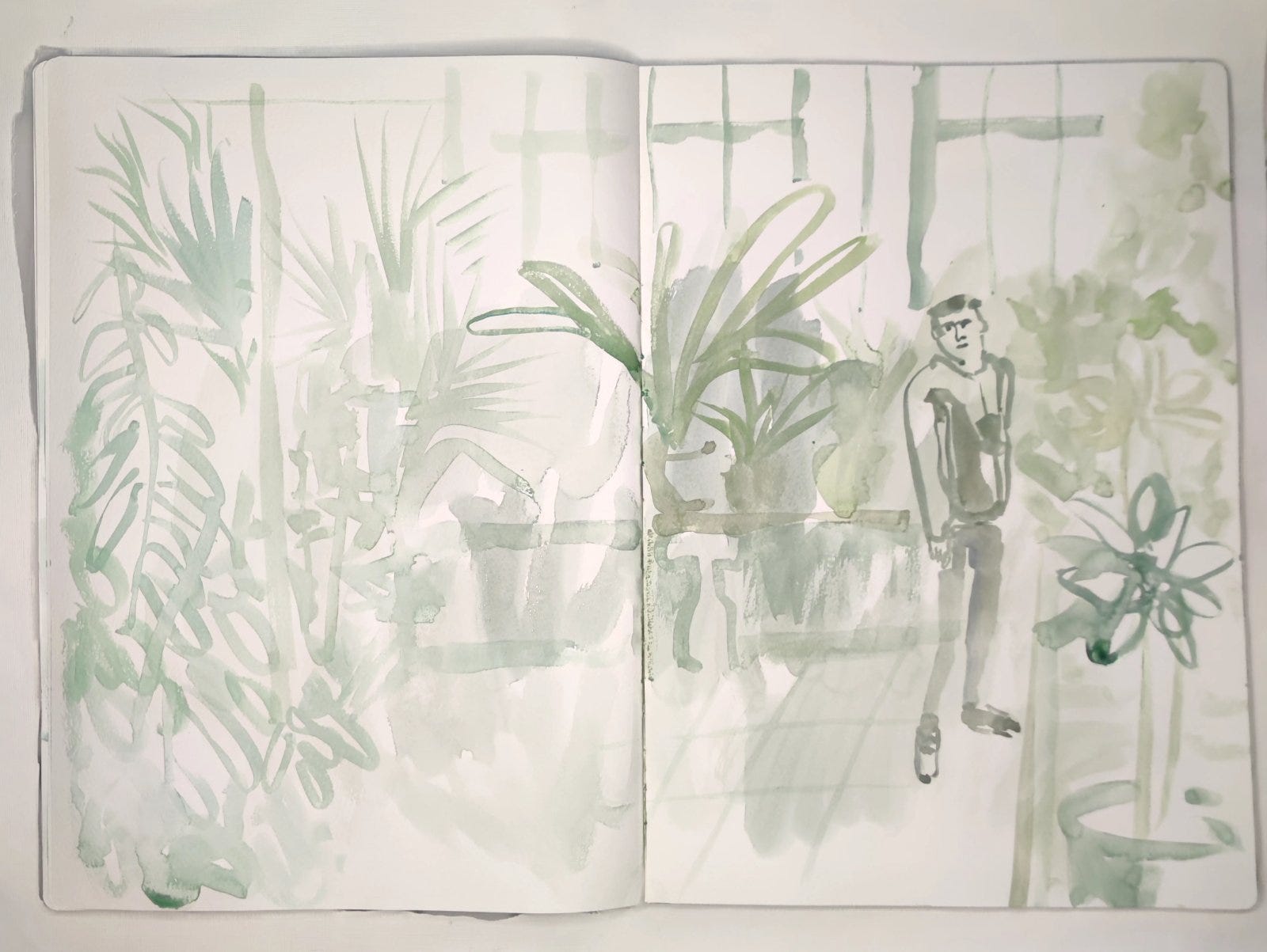
This picture is taken from my largest (A3) sketchbook which is enormous in relation to the range I have been working in in recent years. A2 sketchbook spreads feel as though they are moving beyond the normal realm of the sketchbook in terms of scale. Best of all: they give me the feeling that I’ve already transitioned into the realm of a free-flowing, unboundaried painting.
I have been producing a lot of what might be termed “toned” work in these larger sketches - and they are also often, if not monotone, contained within a particular zone of the colour wheel. Some paintings are orange orientated, for instance, and some green, and many, as in this sketch’s case, are grey (or to be precise - in this instance grey-green).
I should qualify my approach here by saying this: I always like to work with colour to some extent and have never enjoyed just drawing with graphite, charcoal, black ink or pen, and have a bit of an aversion to black and white drawings in fact. But I have been enjoying working with greys lately as long as they are very recognisably colour-tinged. The virtues of greys in the sketchbook is that they can allow you to focus on line work and blocking compositions without feeling you are “only” producing a rough sketch - it still feels painterly and colour-conscious.
Plus as I’ve said before: grades of transparency is everything in watercolour. And so you will always be working with greyed or faded or semi-transparent washes of stronger colours to some extent in this medium. So grey in the context of watercolour is something else entirely, something unique. In many way it is often just another aspect of how dilute or opaque a colour might be at a particular moment.
IV
Originals
I will be periodically showcasing small amounts of originals (five maximum) on Big Cartel, accessible via my bio in instagram (as part of my linktree) & here: Shop.
And if you are interested in pictures not currently listed I can add them to the store.
V
A reminder: if you have enjoyed any aspect of my monthly posts do consider liking, and subscribing to this newsletter. It would really mean a lot and help me maintain this space going forward
Finally if you like my artwork and want to support its continuance you might also consider a small paid subscription. It would be much appreciated so I can evolve and develop my practice. Many thanks.