


Crayon Letter
On crayons, on producing "high-key pictures, on being contrary.

I
Art Adjacent: On crayons
Back in my student years the closest I came to using crayons were oil pastels, the cheapest I could find.
And I didn’t love them. Too soft, too smudgeable, too tacky and liable to smear. They felt like a halfway point towards something I might like but I could never define what was missing.
I did know this much: I loved dry media, particularly coloured pencils, and that love of dry media persists to this day. But I didn’t realise what it was I was missing in my repertoire until I discovered crayons.
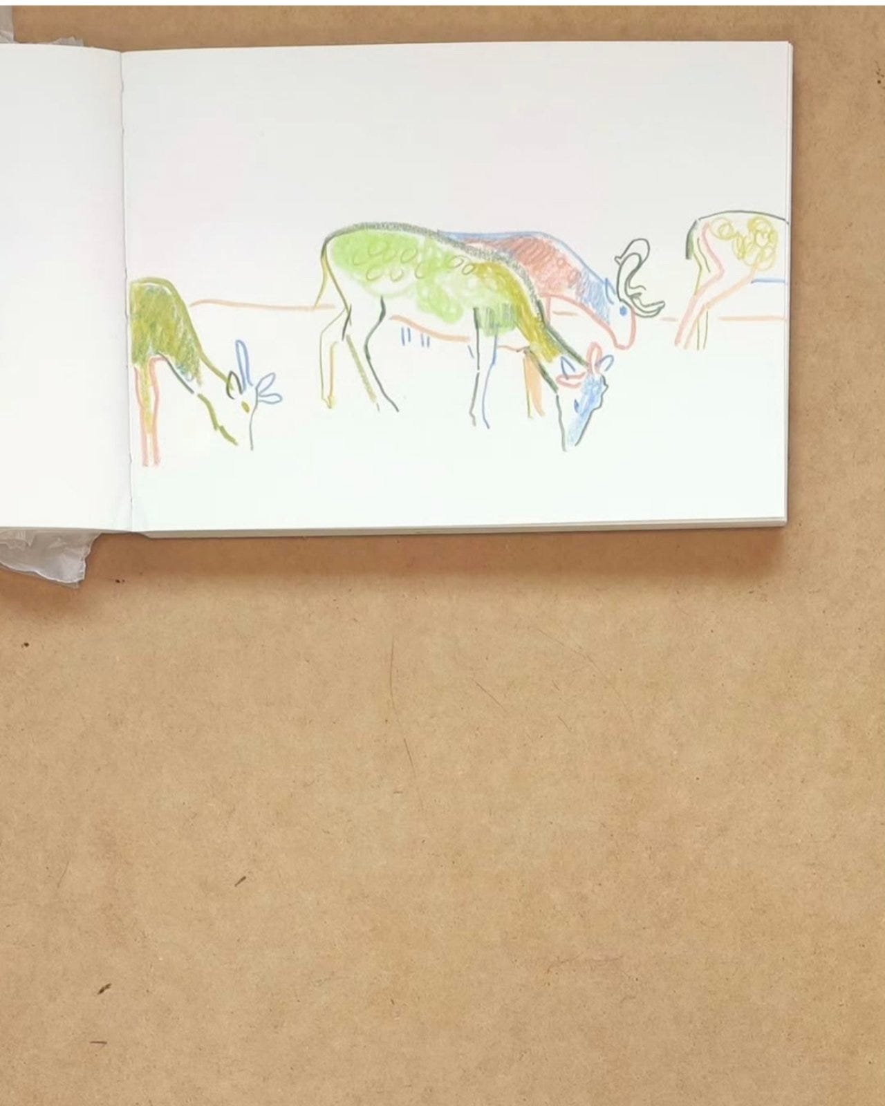
When I say crayons I should be clear: I mean specifically one type - the Caran D’Ache Neocolours, and to be more specific again, the Neocolours II range (the watersoluble type).
Neocolours II are best best described to the uninitiated as artist-grade crayons. They are much harder than oil pastels and soft pastels and do not create dust or smudge or any unreasonable mess. Now they will smudge a little if used in excess or very thickly on a page or in a double spread but not excessively. Nothing in comparison to Caran D’Ache Neopastels or Sennelier oil pastels or the like.
In fact, Neopastels, lovely as they are, exemplify why I can’t get on with oil pastels as they smudge and stain to an incredible extent. I very quickly discovered that they were not for me. They were too messy and it felt like too much work to preserve the sketches I produced with them whereas Neocolours, in my experience, don’t tend to smudge and spoil to nearly the same extent, although I will slip glassine paper between the pages of my sketchbooks as a precaution.
And so it is worth noting that in the world of pastels and/or crayons Neocolours are clean and neat and can produce sharp defined lines or loose and textured blocks of colour depending on your preference. I tend to use them dry but the watersoluble aspect opens up even more avenues for textures and effects.
Ultimately they allow everything you could wish for in dry media. They introduce texture and loose line making into the artwork but are not high maintenance given the moderate to non-existent mess they create on and away from the page.
The lack of mess and ease of use, to my mind, are not insignificant aspects of neocolours, as what I always want from a material is a seamless ease of use so it can slot into my art practice without too much hassle before or after. Speaking for myself, I am much more likely to use and incorporate low-maintenance materials into the everyday run of things and if that marks the difference between art happening more frequently against it happening not at all, accessible materials can all the difference.
And this material, crayons, no matter what version of them you choose, is alluring in other ways too.
As with coloured pencils or markers, drawing with crayons returns us to our childhoods, and arguably to an even earlier phase of childhood artistic expression. To use a crayon, even an artist-grade crayon, is to embrace the possibility of the loosest lines and the wildest swatches of colour.
In other words to apply a crayon to a piece is to invite the liberating possibility of scribbling, something every artist can remember doing in their earliest days. This species of ur-drawing carries with it all the heady glamour of illicit art-making, applied by renegade infants and margin-doodling delinquents to pages, books, walls and any other available surfaces.
Via these sorts of memories, alongside memories of art at its most primal and instinctual, the crayon allows us access to the fundamental mysteries of mark-making, to exploration, and to pure pleasure in colour, texture and borderless expression.
As a final note, and in preparation for next month’s issue I will add that Caran D’Ache have recently released a new “crayon” - the Neoart pastel. They are pitched as something between an oil pastel and a neocolour crayon and so I have already purchased them and will provide some feedback on how I get on with them in April.
II
Art Process: On producing high-key pictures
I have been asked why I produce so many “high key” pictures and thought it might make a good subject to explore in more detail here.
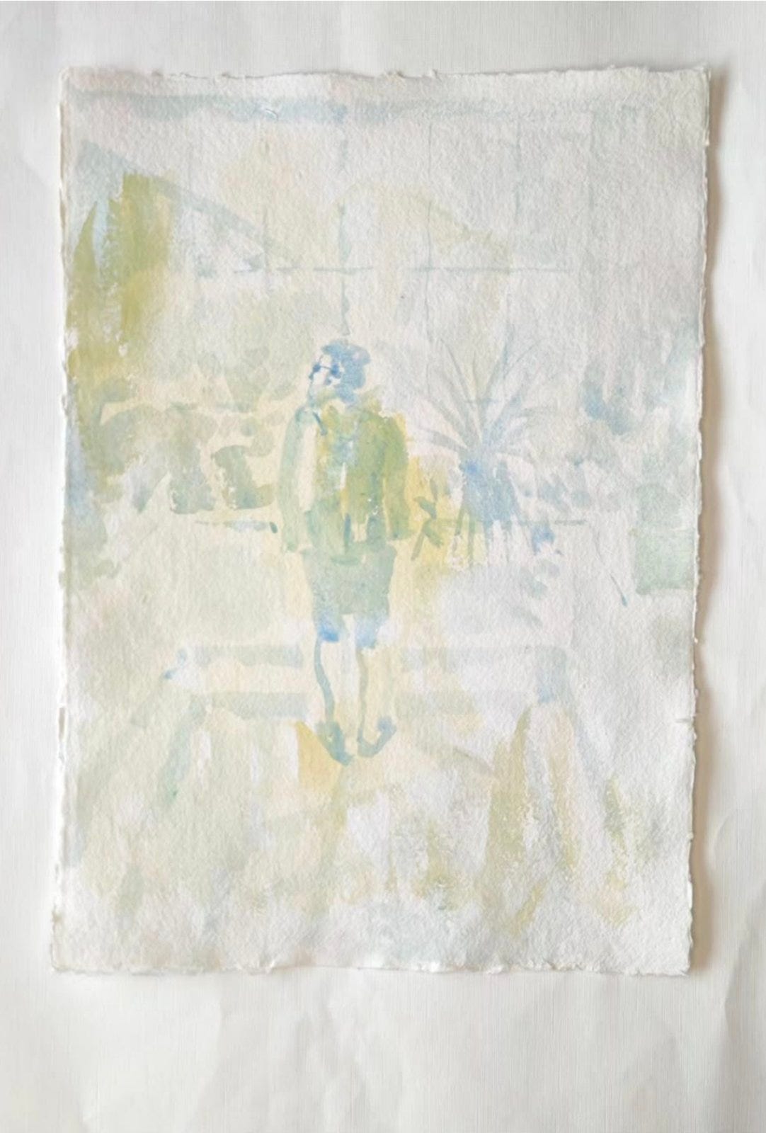
“High-key” pictures are pictures where the tonal range is shifted drastically away from full or deep dark tones. Consequently the darkest zones in such pictures tend to be mid tones whilst the lightest veer towards or approximate absolute undiluted whites.
This is certainly a style I have tended to explore in my work and there are a number or reasons for it. Firstly, I will say this a “style” I tend to adopt in my watercolour paintings for the most part, although also, occasionally, in my sketchbooks too. On the rare occasions where I paint in fully opaque sorts of paint like acrylic or when I work wholly in gouache my tonal range tends to be more typical.
And so this “style” is for the most part an aspect of my watercolour style. I am not sure exactly how it evolved but I will try to describe the evolution of this approach. I know that when I began watercolour I was almost disappointed at first by how diluted the colours were (or could be) in certain instances, but very quickly I began to see this quality as a virtue of the medium and something to be embraced.
I had for a long time in my sketchbooks, regardless of the medium, embraced the white of the page as I always felt it leant a graphic vibrancy to compositions and so I began to incorporate that into my watercolour paintings. One key influence here was undoubtedly prints of various sorts. I love woodblock prints especially but also other sorts of relief prints.
I admire the somewhat laborious process involved in the creation of woodblock prints and the subtle and beautiful effects that can be created and although in a world where I had infinite time and resources I would go to Japan and learn this discipline I don’t feel I will ever get around to adding this skill to my repertoire as drawing and painting are more than enough to manage this lifetime!
And so I feel my high-key style, alongside my use of the (not always) white of the page, is at least partially my lo-fi way of emulating a much more laborious and time-consuming art form. And it is gratifying to a degree to have found a style that allows for graphic effects that are painstakingly difficult to create via printmaking.
I will add this - there are other compelling reasons why I have taken on this very specific approach re: watercolour. I love the potentials of watercolour as a medium but I don’t always tend to find myself enjoying all watercolour paintings. Even at its most accomplished, or, in fact, especially at its most accomplished (whatever that might mean), watercolour can tend to be, to my mind, a very traditional cul de sac within painting.
And so my approach is definitely a choice, and a deliberate swerve away from some of the usual paths. And adjusting the tonal range of my paintings is one way of doing that.
Just as poets attempt to “make strange” the usual forms of language I think it is part of an artist’s job to “make strange” the formulae of painting.
Ultimately, although I love bold colour and try and hope to apply it in my drawings and opaque paint pictures I have grown to appreciate the delicacy and versatility of watercolour, no matter the tonal range.
III
Art Adjacent: My way of talking about art or being contrary
I just wanted to define something regarding how I talk about art on this substack.
I am not a professional artist, more of an “artist in process”. And so I don’t claim the authority of someone with that position or background.
What I do try to do in this substack is provide an account of my process as I learn, as I teach myself in fact, principally through doing, through experiment. And although I don’t trade in “tips” or claim to teach anyone anything I suppose my explorations here do attempt to give an account of what it is like to attempt x or y over a certain period of time and to draw the best conclusions I can along the way.
And this little caveat may become a header for future posts as I think it is important to give context to any observations offered in this substack.
I have limited patience with “how to” books or videos or what-not. Although it can be instructive to pick up information along the way I don’t like anything too prescriptive or directive or absolute. To my mind anyone who wants to be an artist is better off being a bit contrary about “common practise” because anyone who wants to be an artist might also want to consider the value they can bring through presenting an entirely unique position. Otherwise what is the point? And the only way towards a unique position is to be a bit wayward, to take the long way round, bypassing all the traditional short cuts and to commit to questioning everything, even to the point of resistance.
Yes, people do need a grounding in work, in building skills and knowledge, and would be wise to focus on developing some mastery of whatever they deem to be most essential techniques. An art practise is not all affect. I will talk about this particular point again in more detail but here I will just say this: technique is something that needs to be moulded to your will and intention - we might want to draw but an artist isn’t necessarily training to be something equivalent to an architect or at least they don’t need to draw with that level of precision and detail in order to deem themselves artists.
Naturally, I do respect drawing and painting skills and work hard on my own, and in fact love that sort of figurative artist, but I don’t only measure the artist according to their technical mastery. Without some conceptual imagination or some unique position on the world a technician’s work will only command passing admiration.
And so in this substack I am emulating what I gravitate towards elsewhere: the processes of distinctive artists who (sometimes) give an account of their unique view of things and what they learnt through following their inspiration. And I find the tone of such accounts is most persuasive and interesting when it is exploratory and not proclaiming absolute mastery, even when it exists!
Ultimately, I will never project myself as an authority on anything beyond my own process or attempt to be anyone’s guide or mentor as we are all finding our way towards whatever the next thing might be in our process, that mysterious, elusive thing that only we can define because only we have decided on it as our goal.
As a parting note I will add that even when visiting art galleries I am also (a little) contrary.
I hate guided tours whether they be in cities, country houses or galleries. I respect knowledge and research and am not opposed to an encounter with either. But the pleasure of galleries for me is wandering (and perhaps also getting lost), and working through things at my own pace and according to my own preferences. I don’t need to follow the assigned tour and see every painting and read every label and summary. I might instead want to look at one favourite painting for half an hour and read no labels and just observe. I can always come back another time to view the rest!
Which is another (contrary) way of saying that a guide can be useful in certain circumstances but more than anything it is best to attempt to be your own guide, as claiming that freedom exemplifies the fundamental pleasure involved in attempting to be an artist.
III
Originals
I will be periodically showcasing small amounts of originals (five maximum) on Big Cartel, accessible via my bio in instagram (as part of my linktree) & here: Shop.
And if you are interested in pictures not currently listed I can add them to the store.
IV
A reminder: if you have enjoyed any aspect of my monthly posts do consider liking, and subscribing to this newsletter. It would really mean a lot and help me maintain this space going forward
Your art is so soothing for the soul. I just feel how my heart turns into a beautiful tree on a sunny day just by contemplating your works.💚