


Green Gold Letter:
On keeping a watercolour sketchbook, on sketches versus studies, on refreshing your palette, notes on a recent original, & on Green Gold.

I
Art Process: On keeping a watercolour sketchbook
I have been immersed, so to speak, of late in all things watercolour.
And I am somewhat surprised to be honest that I am so fixated on this medium which a few years ago I regarded with an odd mixture of fear and disinterest.
Of course I have a quantity of watercolour paper of good quality that I can only capitalise on via watercolour (or goauche) as it isn’t the right texture for mixed media or drawing but there are other aspects about this medium that has driven me down this unlikely (for me) path.
For one thing I am finding I relish the challenge of a tricky or temperamental medium but I also enjoy the medium in itself. You work as much with water as paint in this instance which appeals to me. I like rendering with washes, drawing with transparencies. I like grappling with things somewhat insubstantial.
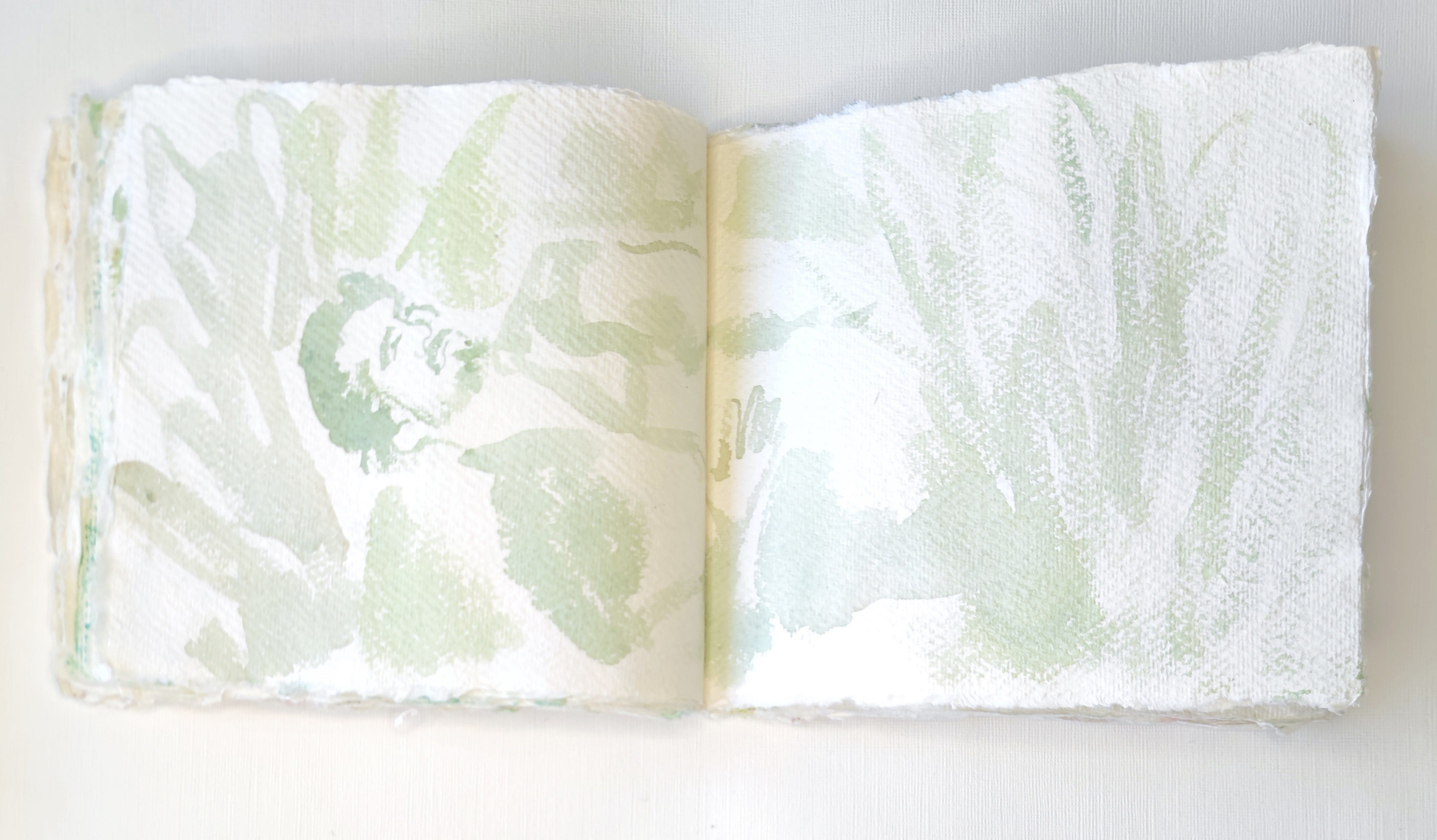
And as I am in a period of using what I own (and not purchasing more) and not wasting anything (however sceptical I might have grown about its usefulness or suitedness to my style) I decided I might as well, in the midst of using my supplies of watercolour paper, also use two watercolour paper sketchbooks I purchased by accident (I thought they were packets of paper).
And I am surprised to say how pleased I am with them: with my ability to work with them and manage their textural challenges (and virtues as it happens) and that the ultimate effect is (to me at least) quite novel and dare I say it quite sophisticated and novel.
I would go so far to say that although I approached them somewhat tentatively (seeing myself as not a watercolour artist) and although my intention is to use sketchbooks a lot less I would consider the occasional re-purchase because the ultimate finished sketchbook is a more beautiful object than any of my other sketchbooks and qualifies I would say as an art object in itself, possibly by virtue of the beautiful paper.
From an art practise point of view I would also add this: these sketchbooks are good for promoting a creative looseness as they effectively demand looseness. There is no other way of working inside them. And for someone who has been exploring my relationship with paint in recent years they are actually a wonderful training ground for drawing with a brush in multiple new ways.
I would say that the beautifully blotchy and scrawled and dragged and scraped pictures I’ve produced in these two sketchbooks are truer approximations of useful, preparatory sketches than I’ve produced before elsewhere.
In other sketchbooks I have drawn, somewhat self-consciously, and at worst produced something unfinished and basic, and at best produced something finished but also equivalent to a finished piece I might produce on hot press paper.
But in these sketchbooks the sketches are true sketches, or studies (more on that below), but are also imbued with their own unique loose and expressive virtues.
Ultimately, they are worthy specimens in their own right (and arguably elevated because they are rendered on high quality paper) but exist in a very separate category to what I would produce in a finished picture.
II
Process Notes: Sketches Versus Studies
Now that I’ve transitioned into working on artist-grade paper I’ve had cause to think about the difference between sketches and studies.
The distinction I’d make is that sketches are preparatory work performed in a sketchbook whereas studies constitute preparatory work performed on separate pieces of paper.
From what I have observed in other artists methodologies sketchbook work often appears to be an aspect of the earliest stage of preparation for a project whereas studies might be seen as a later stage of preparation. In some ways studies might be viewed as trial pieces or works that are meant to help an artist move closer and closer towards a near-to-hand end point or “finished” piece.
Of course methodologies vary greatly and so I have no fixed view of how all or most artists work or should work but I do feel that in relation to my own work I have reached a stage where I want to develop what I have gathered in sketchbooks and on paper over years of work.
I don’t believe in hierarchies in relation to all these stages of work as I feel sketchbooks and studies are works of art in their own right and I am suspicious of the elusive definitively “finished” art object. And I feel my recent work on paper equals a series of “finished” pieces and not merely a transitional phase leading to works on canvas. In fact I could happily work exclusively on paper from hereon as I have taken to it.
But I do feel liberated in a strange sense from sketchbook work. Sketchbooks are in vogue at present and whilst I can understand why I also felt for me, over time, the format became restrictive and somewhat closed off from my original intentions which has always been to create works of art.
Sketchbooks are an end in themselves and I would certainly like to own certain artists sketchbooks as much as their paintings or drawings so I see their artistic value and curiosity but I am enjoying this new phase of work and would recommend stepping away from the format of the sketchbook from time to time as it does allow you to see your art practise on different terms and in a new light.
I will make one exception in this: the two watercolour sketchbooks I’ve been using lately. As they are composed of high quality paper I feel they belong in the “study” category as the paper just elevates everything - you can’t argue with 100% cotton as a texture and a surface, after all!
III
Art Adjacent: On Refreshing Your Palette
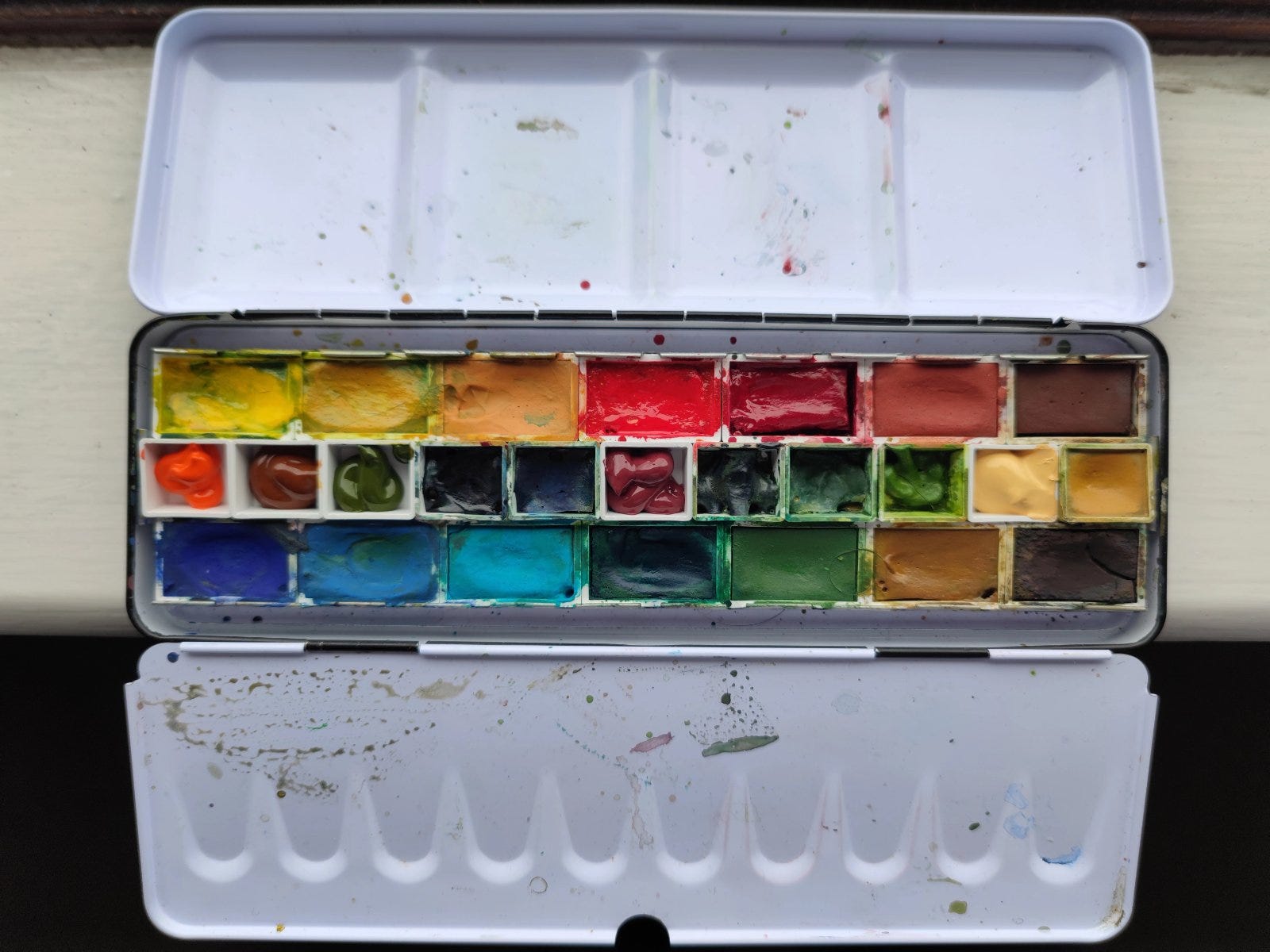
I have one official watercolour palette (from Kremer) and one miniature gouache palette I have been trying out lately so I can paint in both media side by side.
The watercolour palette has its 14 original colours and some half pans I added into the central aisle and the gouache panel is a 12 colour basic palette and I like to work with what I know to many people is a fairly limited palette (although to many others this is probably a lot).
I sometimes cringe when I hear people talking about “work flow” and “flow” in general but there is some truth that any methodology you apply will probably benefit from being refined as you discover what works for you and what doesn’t.
And so in the course of this season of painting I have noticed what colours I look for and what colours I don’t and what colours I wish were near at hand. I’ve had the same realisations re: both paper and brushes too along the way but for today I will just talk about paint and palettes.
And wanting to refresh things and make it easier to find the colours I lean towards most often and to capitalise on the limited space in my palettes I was considering editing what I own and purchasing some new paints to fill gaps when I remembered that I have a few extra colours in tubes which I haven’t been using and it so happened that some of them match colours I’ve been looking for lately (but perhaps didn’t realise before were important colours).
And here’s the thing. The whole point of the palettes is so you have your chosen colours near at hand but also so you remember what you own (through what you have near at hand). I don’t have a vast collection of paints compared to many painters, in fact my extra colours are only a handful, but I somehow still forgot in the midst of hankering after an orange or a new mid yellow that I had a beautiful Pyrolle Orange and a Quinacridone Gold, not to mention a wonderfully granular Mars black.
For me it is important to not buy too much or too often as I can often lose sight of what I already possess and also underestimate and underexplore the colours I already own. There is no way I have complete mastery over my fairly limited palette. So an occasional review or audit is no bad thing in my opinion. Check in with your “collection” before you rebuy. Can you mix the colours you think you need or can you use substitutes you already own?
The other aspect of this that interests me is that I do now have two refreshed palettes. I changed out 5 colours in my main palette and 5 again in the small palette and am looking forward to how that will change how I work and the work I produce going forward. That alone gives me a renewed curiosity towards the new combinations and possibilities that might evolve out of these “new” palettes.
V Process Notes:
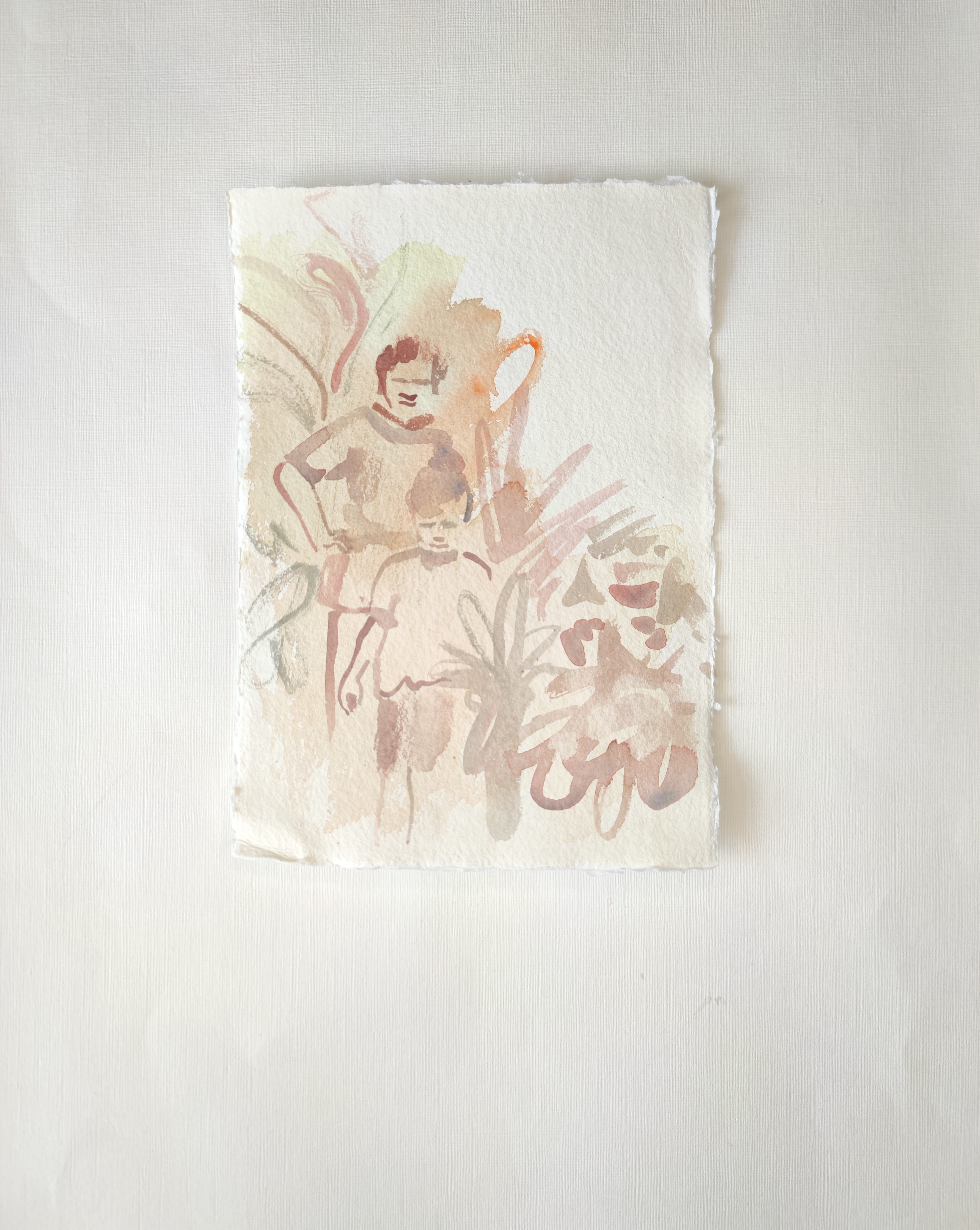
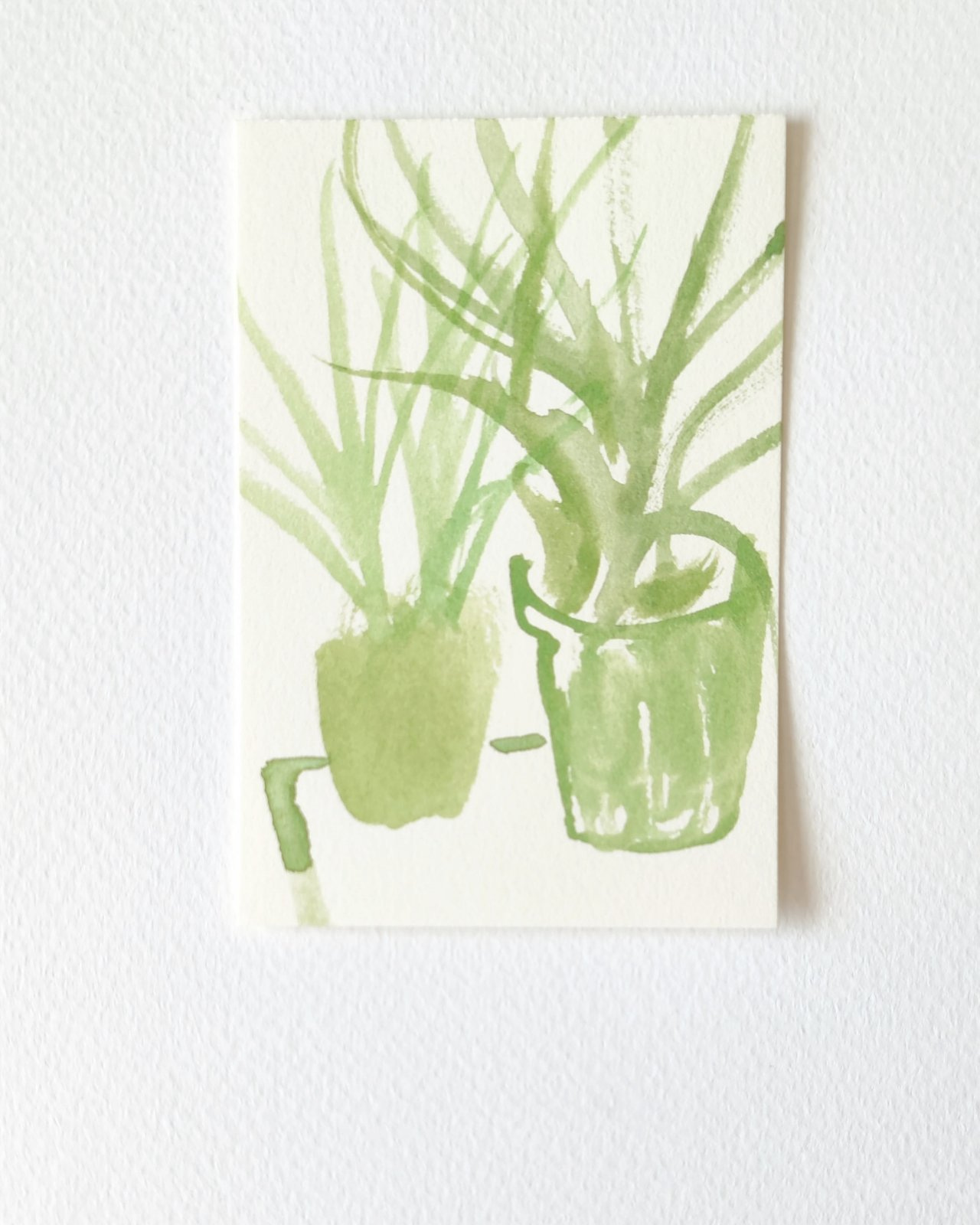
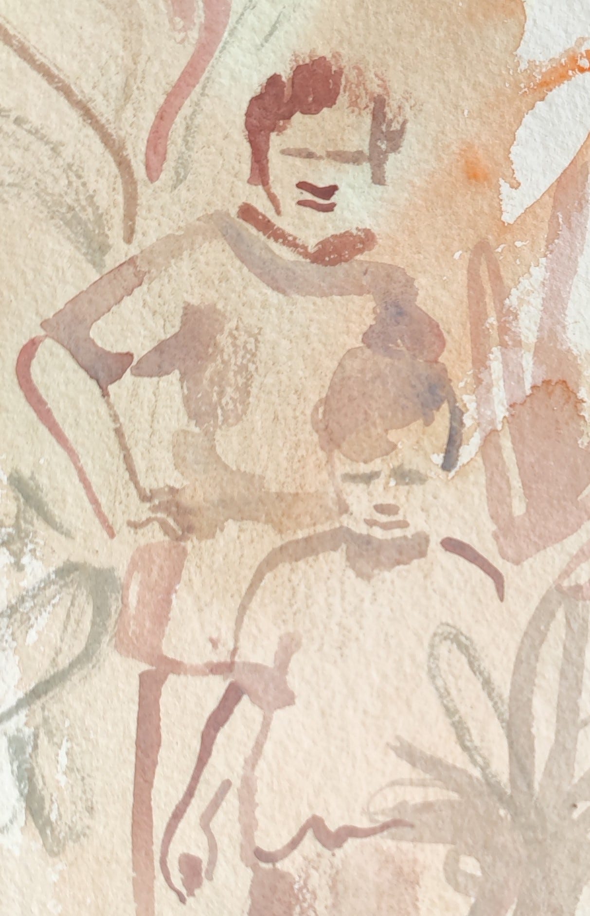
My Latest Sketch: “Memory of a Garden,’ 2024, watercolour on cotton paper, 5.83 x 8.27 inches/14.8 x 21 cms.
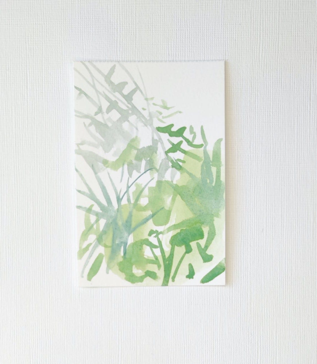
This picture is part of a series of small works in paint on paper.
My aim has been to be loose and gestural and also fairly minimal re: mark making. I am enjoying the discipline of that and find it suits me as when I go astray in my work it is always in the direction of over-working a piece!
Of course there are different methodologies but I do feel that a good aim for most artists (and for me certainly) is to find a style that allows for immediacy and quick work. That might be a style adopted alongside a focus on more lengthy and more considered projects or might be one’s sole approach creatively but either way it attracts me as I associate mastery with lightness and directness. An unencumbered style, in other words. At a certain point it would be wonderful to master how to get out of your own way!
This piece is based on a childhood photo of my partner who has lived away from his country for many years. So there is a blend of sadness and nostalgia in this picture. I very much hope he sees his family again soon for a visit of some description.
VI Originals
I will be periodically showcasing small amounts of originals (five maximum) on Big Cartel, available via my bio in instagram (as part of my linktree) & this link: Shop.
And if you are interested in pictures not currently listed I can add them to the store.
VII On Green Gold

Let me say this: in my palette gold is a green.
But that is another story. Green Gold is a green too, but a less disputed green.
It is quite various depending on the media you use. Many of the pencils I own that are called green gold veer yellow, yellow ochre-ish to be semi-precise. Whereas some of the green gold paint I’ve encountered is a fresh, ripe, light sap green variant.
Perhaps it is the notion of green gold we enjoy and seek to emulate in our palettes and our pictures ultimately as I am not sure it is one agreed colour. For some it is the first colour of buds in early spring and for some it is sun-burnt and fading yellow of early autumn but perhaps what all these variants have in common is this notion of mystery of summer - the colours that mark its passage, most particularly its sometimes indefinable beginning and end.

VIII
A reminder: if you have enjoyed any aspect of my monthly posts do consider liking, and subscribing to this newsletter. It would really mean a lot and help me maintain this space going forward
Finally if you like my artwork and want to support its continuance you might also consider a small paid subscription. It would be much appreciated so I can evolve and develop my practice. Many thanks.