


July Letter
On uplifting summertime light, watercolour pencils, the paintings of Edvard Munch, rediscovering old and/or neglected art materials and forbidden gardens.

I
Art Adjacent: Summer House
Hello once again,
I have spent one winter in our current house and one spring, and now (the beginning of) one summer.
And it has taken this long for me to understand its moods and various lights and shadows given it possesses an orientation (south facing back garden) I am unfamiliar with. Our last house had a north facing back garden and so in many ways this house has been an adjustment.
But now the sunnier days have arrived I realise the benefits of this new orientation in ways I hadn’t anticipated. Before, in our former house, we skulked in the shady underside and the sunlight seemed to fan across the front of the house – and always appeared to be far away as though seen through pondwater. Or alternatively we waited for the sun to sidle round to our back garden around the early evening.
But now we can hide away (as is our preference) round the back of the house and the sun is with us every hour, like the sort of dog or cat that follows you round the house all day, resting wherever you rest.
I knew before, from my art practice, to pay attention to light, and to study it, in order to understand it better, but now, just in terms of living and being in the day to day I am understanding what it’s like to have light all around you during the hours you most need it: and now it lights my way sketching or reading or working throughout my mornings and afternoons.
II
Process Notes: Watercolour Pencils
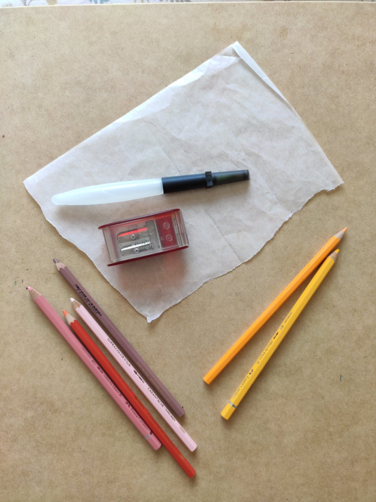
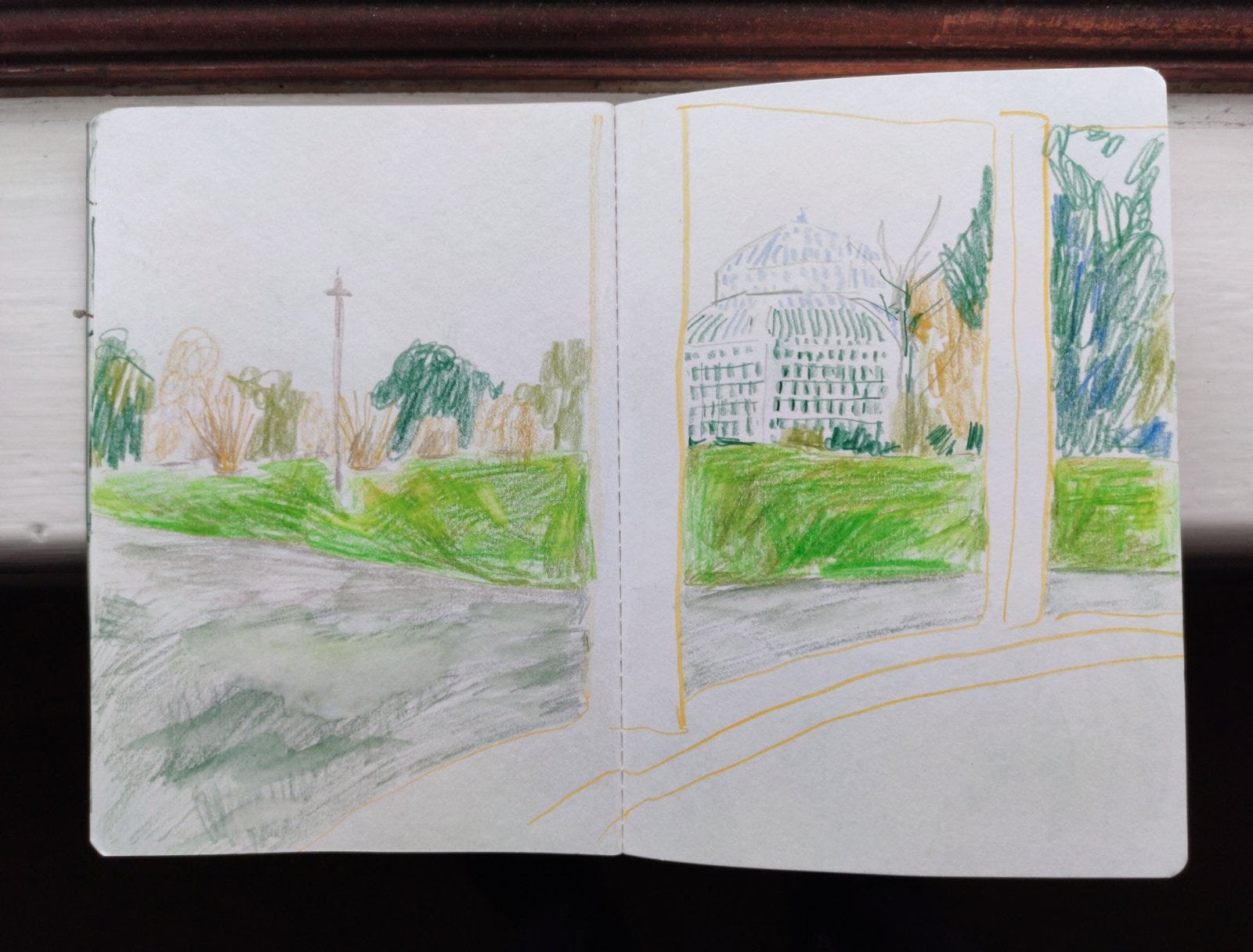
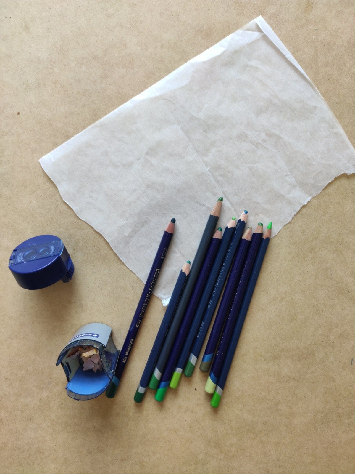
Last month I was focused on experimenting with watercolour pencils (and still am more or less).
This is a medium I have struggled with somewhat. As with other watercolour media (neocolors 2 for instance) I often end up preferring the results I get when I use them dry! But in the spirit of this year where I embrace all things paint (or “wet” media in general) I am trying to make watercolour pencils work for me.
And in the process I am, as always, making some interesting discoveries. For instance, I had established in my mind before which were my favourite “dry media” colouring pencils but in this new sub-division of untried and untested pencils I have discovered new preferences along the way. I am liking uncommon colours for me: rich Cadmium Dark Yellows in particular.
The fact is that the non-watercolour version of certain pencils can be subtly different in dry form to an equivalent watercolour pencil in the same brand. Even the same pencil, dry and then wet, can produce surprisingly contrasting or dissimilar colours. All of which is to the good as it effectively doubles your palette and colouring possibilities!
I never use “dry” coloured pencils in the manner of artists who layer up representational pictures, sometimes to a photo-realist extent. My style with dry media has always been more about expression and embracing mark making as opposed to a photographic “smoothness.” That question of approach is a whole other issue, and a whole other newsletter potentially, but as a consequence of rarely working in multiple layers or towards a highly realistic finish what I grapple with most of the time is the expressionist potential of coloured pencils.
In “dry” form this can sometimes be a challenge as the effects can ultimately be too subtle colour wise, and I have often noted in some of my coloured pencils pictures a timidity or reticence that is often a factor when wrestling with new media but has particularly dogged my efforts with coloured pencils. My happiest place is probably with extremely bold media like markers and crayons and more recently, gouache and acrylic paint.
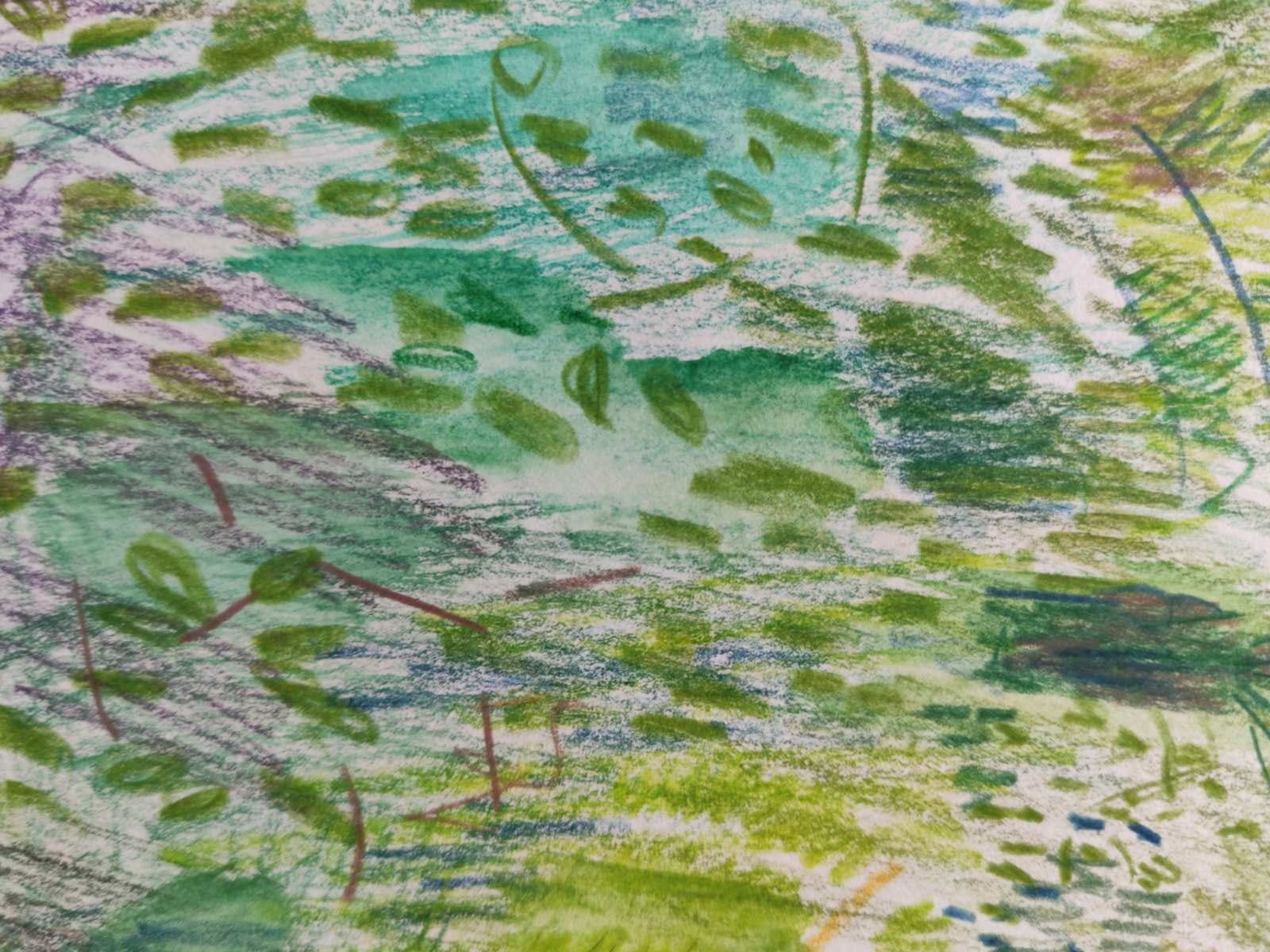
But I have pushed on through my struggles with coloured pencils and would note that this is a medium that requires some extra boldness and flair and daring. So despite the fact the colour washes produced by coloured pencils are extremely varying in intensity and need to be tried and tested the diversity of texture and colouration you get with watercolour pencils can be an extremely helpful remedy against the novice’s tendency to fall into an insipid half-heartedness.
Needless to say, I love subtlety in art too. But there is subtlety and delightful translucence and all the rest of it and then there is watery indecisiveness. We aim for the former each time naturally. I do love that certain watercolour pencils produce super-vibrant bursts of colours that carefully applied could elevate or distinguish drawings that otherwise might fail to come alive. But it takes a little time to find the pencils that work best for each individual artist.
In any case, once you’ve found the most, ahem, sympathetic pencils, they can become especially useful if you want to leave your paints behind and go out sketching with an all-in-one drawing and painting tool encapsulated in one neat pencil (although bring a water brush!).
So, I am finding myself liking watercolour pencils more and more (especially when used alongside dry media) despite the struggles and can see why they are favoured by illustrators.
In summary, this is a medium to adjust, as always, to your own needs and process. But, in theory, at least, I would say that watercolour pencils are very versatile as you can potentially draw with precision and apply diffuse washes, back and forth, back and forth, as you prefer.
And this possibility more or less marries with the way I tend to like to work, moving back and forth in different modes, in one instance textural and imprecise and in another precise and emphatic.
III
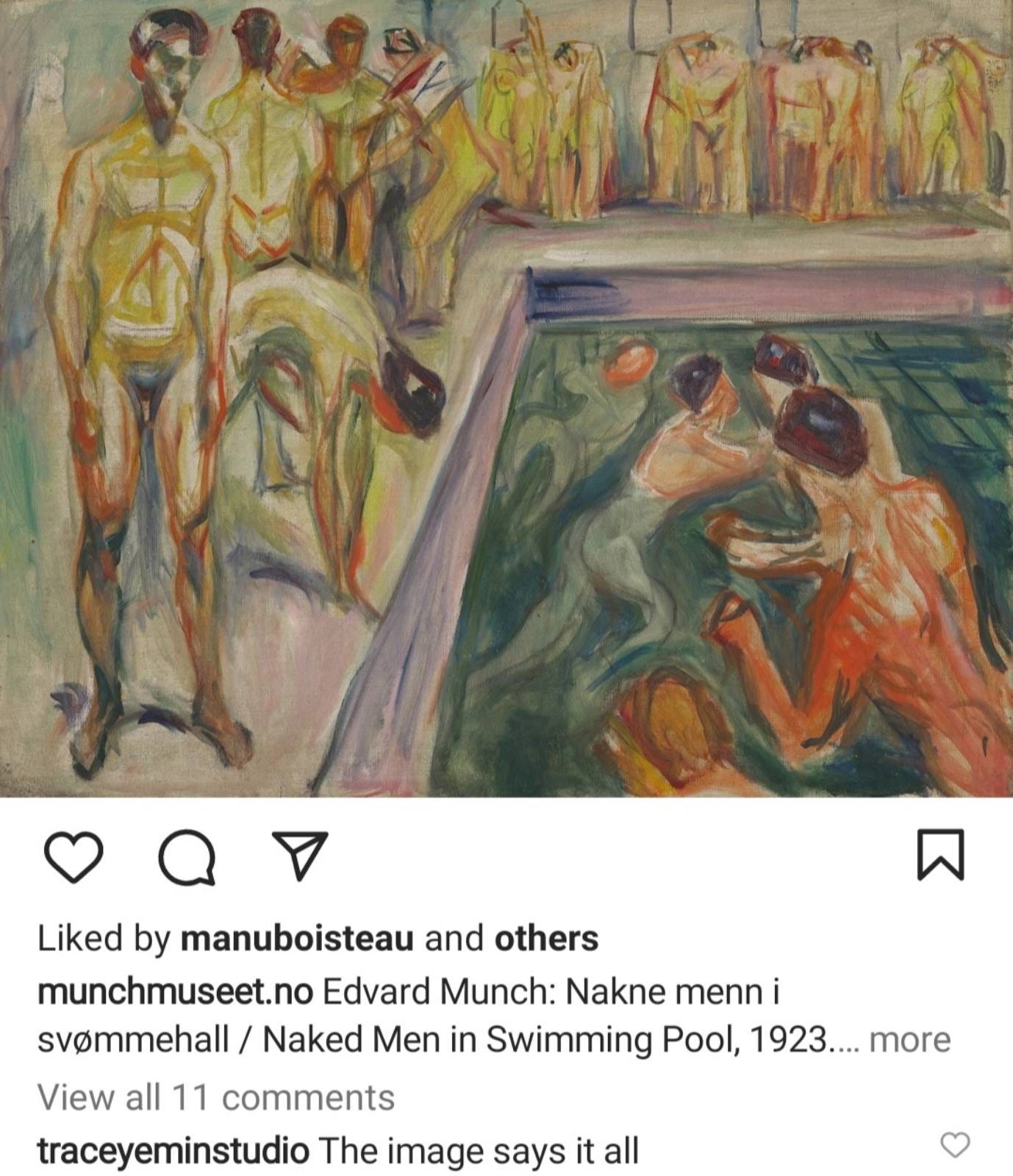
Art Objects: “Naked Men in the Swimming Pool”, 1923, Oil on Canvas. “Flirting in the Park”, 1942, Oil on canvas. “Bathing Men on Rocks,” Edvard Munch, 1915, Oil on Canvas, Oslo.
I wanted to attempt a Munch analysis ever since I’ve begun this series but wasn’t able to choose a favourite image amongst the many I love.
But now seems as good a good time as any to attempt a reading of Munch. It feels like he is receiving a little revival following Tracey Emin’s book and exhibition dual “homage.” And more generally I seem to see his art everywhere. That he is a perennial favourite on social media and elsewhere appears to be undeniable.
And so in light of that I won’t focus resolutely on just one image of his but will look at a few back and forth, and just note certain distinct aspects of them briefly.
Firstly, I feel that it is no surprise that Munch’s work is still with us: he was part of the startling vanguard of his time and today his work still feels modern and urgent. You look at contemporary C21st painting (Tracey Emin again, and Peter Doig), and you look at Instagram and you see his influence and style everywhere.
There is something accessible and immediate and vital about his work. His colours are colours I see in contemporary painting, his very particular depictions of the human form chime with work I see everyday on social media – I see versions of his figure drawings, his nudes, his passers-by in other artists’ sketchbooks and paintings. He is still with us, still an influence, still a modern.
Personally I come back to this painting, “Flirting in the Park”, 1942, Oil on canvas, persistently, and particulary at this time of year. I love the palette and distorted camera lens composition. I talk a bit about “obvious” greens a little in the next section of this month’s newsletter, and many artists these days will make a point of skewing towards dirtied up versions of key colours, and skirt past too obvious or crude ultra-vibrancy.
But I think a good artist knows how to make used of strategic vibrancy and this painting is a case in point. I love the “obvious” mid-tone summer greens that make up the backdrop of this painting. They make it distinctive. It sings because of them. It is a painting of summer because of them. And once again, this feels like the vibrant, unafraid, and unself-conscious palette of a modern artist you wouldn’t be surprised to discover in the C21st.
I agree with Emin’s possibly arch comment on the Munchmuseet account (on Instagram) in relation to “Naked Men in the Swimming Pool”, 1923, Oil on Canvas: “The image says it all.”
I love Munch’s version or idea of the nude form in this painting and elsewhere. In the foreground you can perhaps see the influence of Cezanne’s nudes and arguably in the background you might contend to see the influence of some of Picasso’s, but his style is distinctive and individual throughout, and constitutes a cohesive revision of other forbears’ styles.
This painting illustrates Munch’s style at its best – it feels loose and improvised and as you would expect: expressive. And that is the essence of Munch’s work – his finished paintings all have the aura of sketches, of something unfinished or seem to exist in a category where the notion of “finished” is close to meaningless. Klimt has often been admired for his beautiful drawings, his loose sketches, and sometimes critiqued for the occasional stiffness of his “finished” pieces. And that is the essential challenge of almost every painting: to maintain a sense of the energies that produced it and Munch paintings always manage to hold onto that vital quality.
And that vital quality is appropriate in this instance as this particular painting expresses (amongst other things) the early C20th notion of masculine vitalism (usually associated with swimming and the outdoors) and this strain of Munch’s work, the paintings he painted on beaches, en plein air, (and there are photographs of him painting giant canvases outdoors wearing not very much himself) might even be argued to constitute a sub-genre in his oeuvre. I won’t wade into an area I haven’t the scope or time to properly explore in this little survey but there is an obvious homoeroticism to aspects of Munch’s work, and this piece, and the last painting I will look at, “Bathing Men on Rocks”, 1915, oil on canvas, both fall into this sub-category.
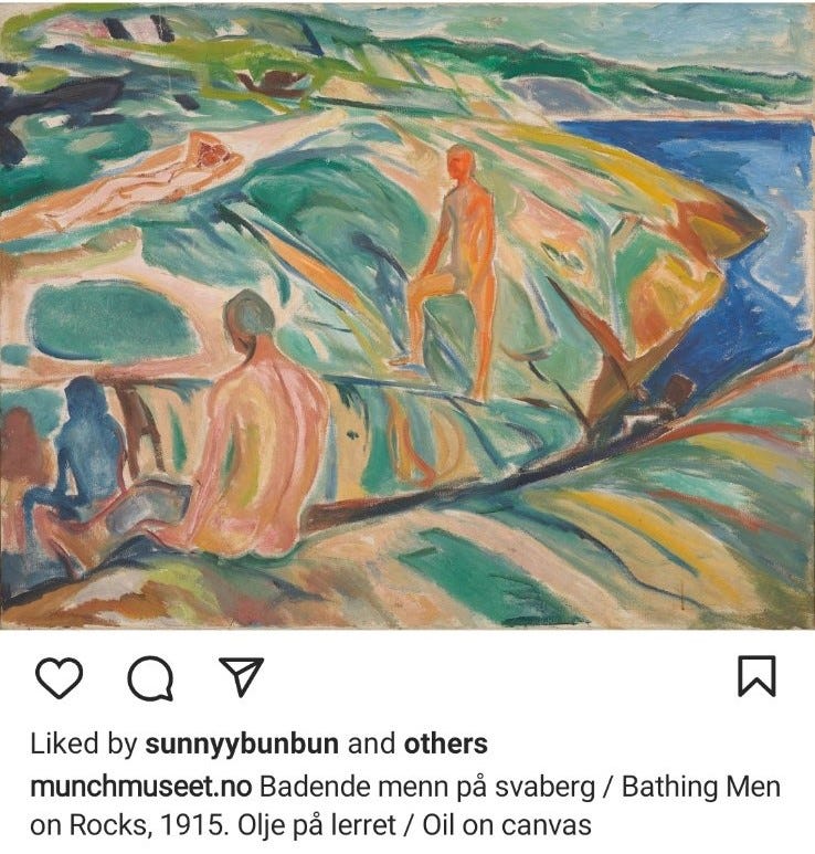
This last painting, an earlier work, appears to me to have a less distinctive style than the two other paintings I have discussed. It might even be viewed as something akin to certain Bloomsbury paintings, or a contemporaneous English painting, and that would not necessarily be a bad thing. But it is, at least to some extent, a decorative painting and feels somewhat subdued, as the energies of the figures portrayed are muted by their indistinctness and lack of vibrancy and, yes, vitality.
And they are, more or less, subsumed into the landscape they inhabit. And what distinguishes Munch’s later style is that his figures are “of the landscape”, connected to it, but also distinct and individual. They stand out, and carry a sometimes primal, sometimes sensual, sometimes violent vibrancy and aliveness. In the two later paintings, which both represent aspects of Munch’s mature style, the figures stand out from the environments they inhabit and are both both vital and vibrant. And there is a clearer ownership of a sexuality (whatever it might be) in these later paintings.
For that achievement alone much can be learned from studying these later paintings that are, to my mind, as much “psycho-dramas” as they are landscape paintings or figure studies.
IV
Art Process: Using Old Materials You Aren’t Sure You Even Want to Keep
I don’t know if this is just me but like many people I collect (or accumulate) a lot of art materials, but I also have a tendency to part with them (or attempt to) if I feel they either aren’t a fit with me, or of poor quality.
Having said that even I find it hard to part with art materials when more generally I am the anti-hoarder personified! Lately, having gathered together quite a large collection of coloured pencils, I decided it might be time to whittle them down (so to speak!) and purge the least-used items in my collection.
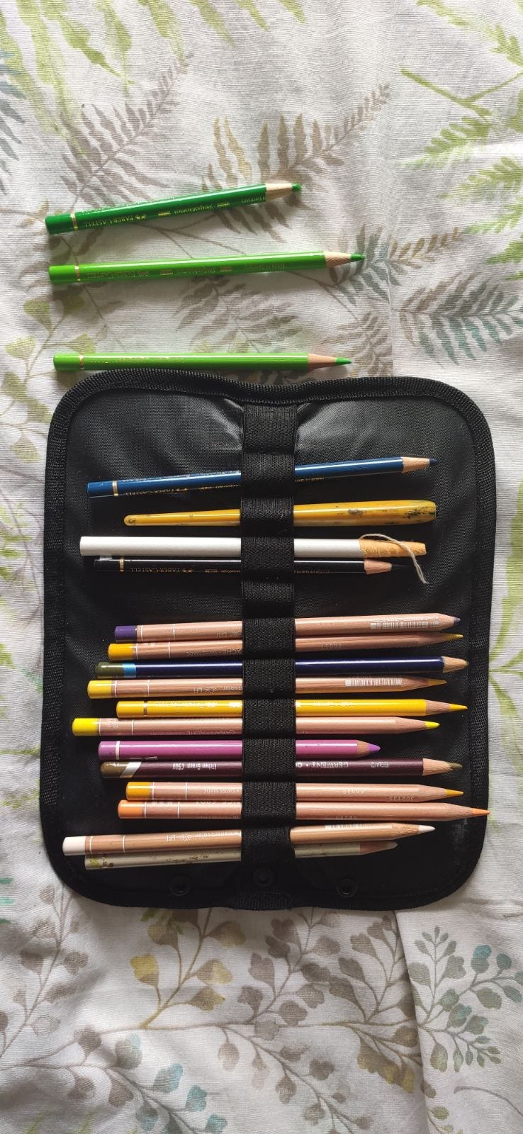
This process, so far at least, has been a failure, at least in terms of discarding items. I collected together my least-used pencils and then decided, in order to be fair, to give them a short period to redeem themselves by setting myself the project of working on a sketchbook where I was only permitted to use the pencils I have tended to leave to one side up to now.
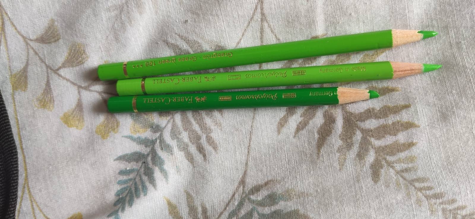
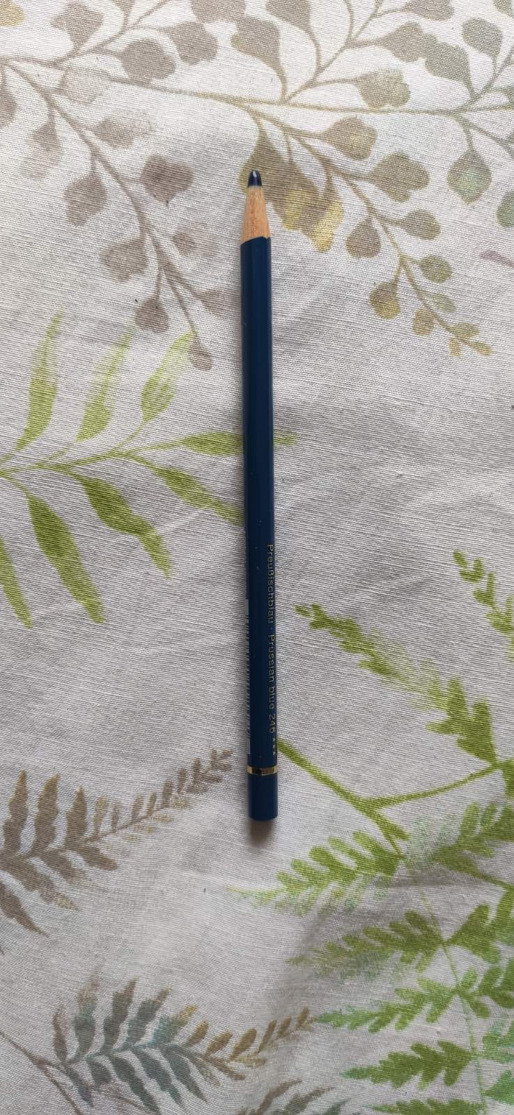
The process has been interesting in that I have discovered some pencils did redeem themselves when I spent more time with them, and some to an incredible degree. I had some lurid, nearly-radioactive greens that even I had hesitated to put to use up to now (and I like an “obvious” green from time to time) but I must say I do like them after all. Radioactive green all the way! I have also, in a complete side-swerve, (especially given that I don’t tend to love blues), discovered a new love for a particular Prussian blue pencil. In fact it has become my favoured dark blue of the moment.
The lesson of this, for me at least, is something I have half-suspected up to now in any case: that (putting aside the question of lightfastness for a moment) there are no truly bad materials or colours. They all have their uses if you use them in the right contexts or ways, and there are always as many right ways as there are wrong.
V - Art Adjacent II: Forbidden Gardens
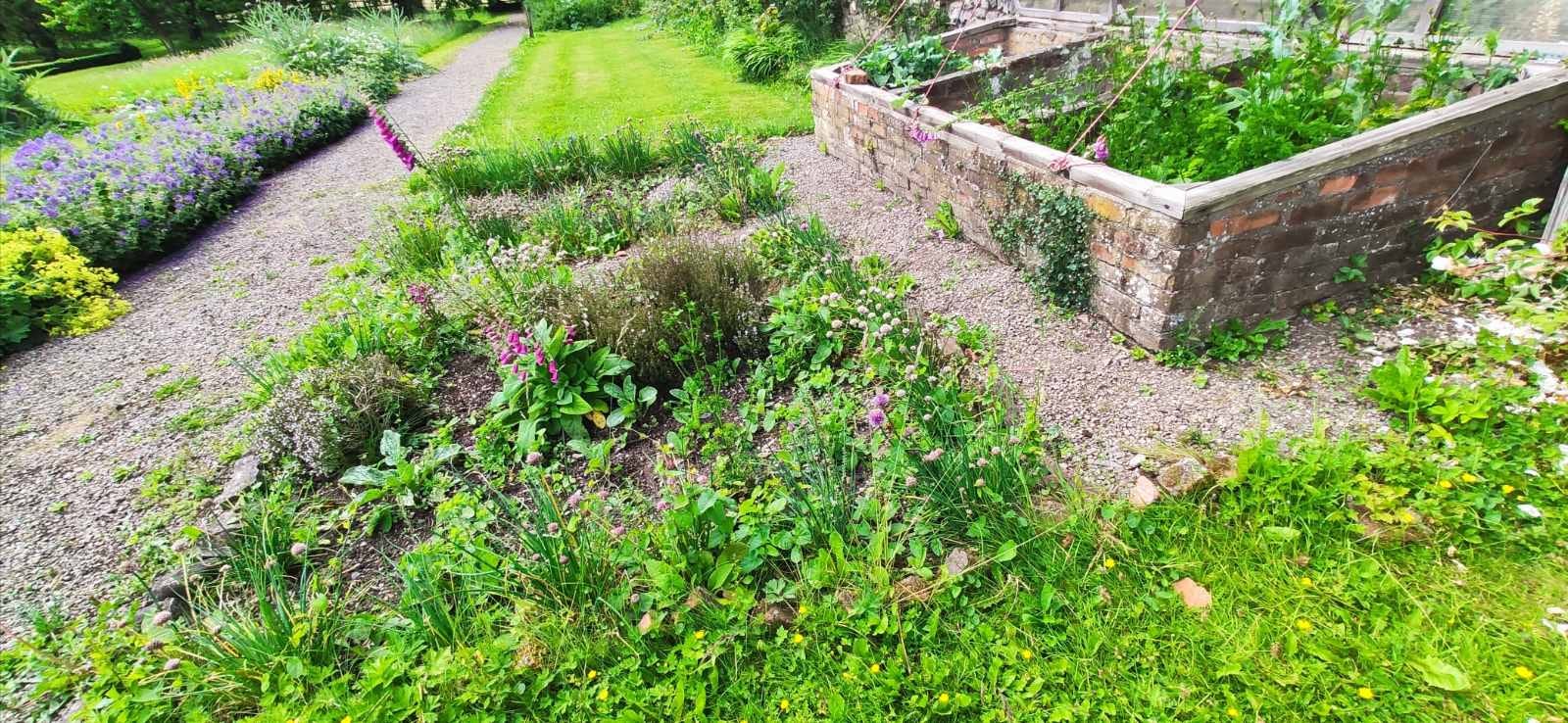
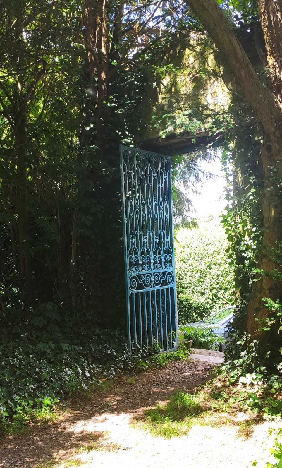
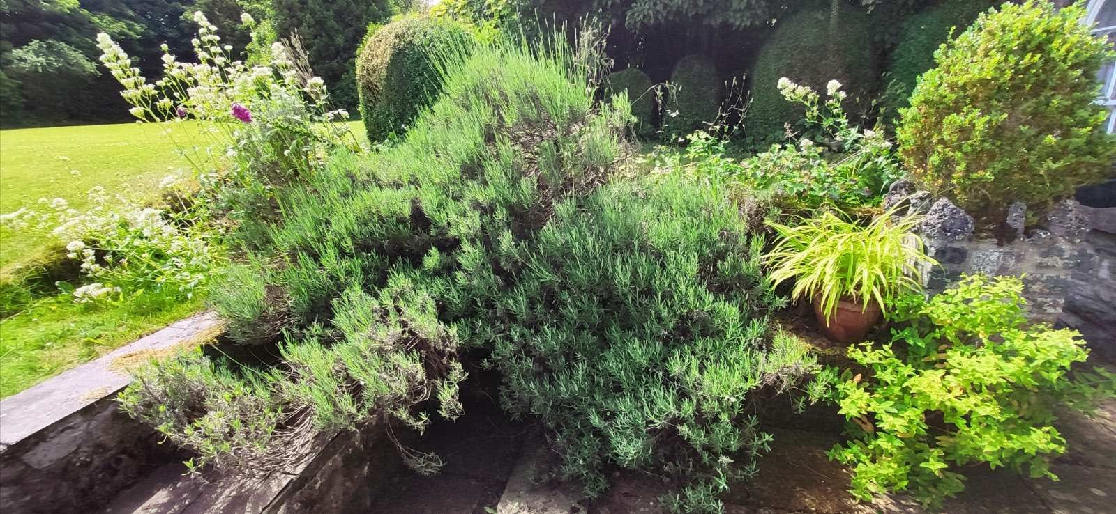
Last year, quite inadvertently, me and my partner were visiting a town quite close to ours and through ignorance wandered into the grounds of a castle (the gate was open, and there was a tour promised on a sign).
We went to the door and were told that the tour was over, but hesitating, we discovered in slow stages that the castle had the most amazing garden, which I am almost positive (hence my reluctance to name this place) that we weren’t supposed to wander around like awestruck, unruly kids. Having said that we met others that day with a similar air of having stumbled across a secret place usually closed to the public.
I didn’t have time to sketch that day but fortunately I took numerous photos and am still working through them as references a year later. So even if that garden is prohibited territory and can’t be returned to, I shall be opening that file of photos every summer from now on to remember and also to sketch a little yet another garden lost in time, but not forgotten.
VI
A reminder to check out my website shop at davidmonteiroart.com. Or follow the link in my instagram bio. I have a good number of prints available – some landscape, some botanic, a small few focused on animals and birds. Details of my printer supplier is featured with each listing.
UK and EU deliveries are custom free.
Also please do check out the small (but slowly increasing) collection of originals I’ve been adding to my website store over the last few weeks.
And if you are interested in pictures not currently listed I can add them to the store and you will receive them at the same rates as the ones already listed.
VI
This newsletter will continue on a monthly basis.
In the meantime if you are reading regularly I would ask that you would please consider subscribing to this monthly newsletter and if you would also consider buying me a coffee on Ko-fi at this link (https://ko-fi.com/davidmonteiro) it would be much appreciated so I can evolve and develop my practise. Many thanks.