


Light Cobalt Blue Letter:
On making my own acrylic markers, on testing materials, on “Five Pieces,” on a recent parkland sketch, on my substack, & on Light Cobalt Blue.

I
Art Process: On making my own acrylic markers
I have been improving the storage set up for my art materials lately and simultaneously purging materials that are not used too much and have enjoyed re-purposing whatever I can along the way.
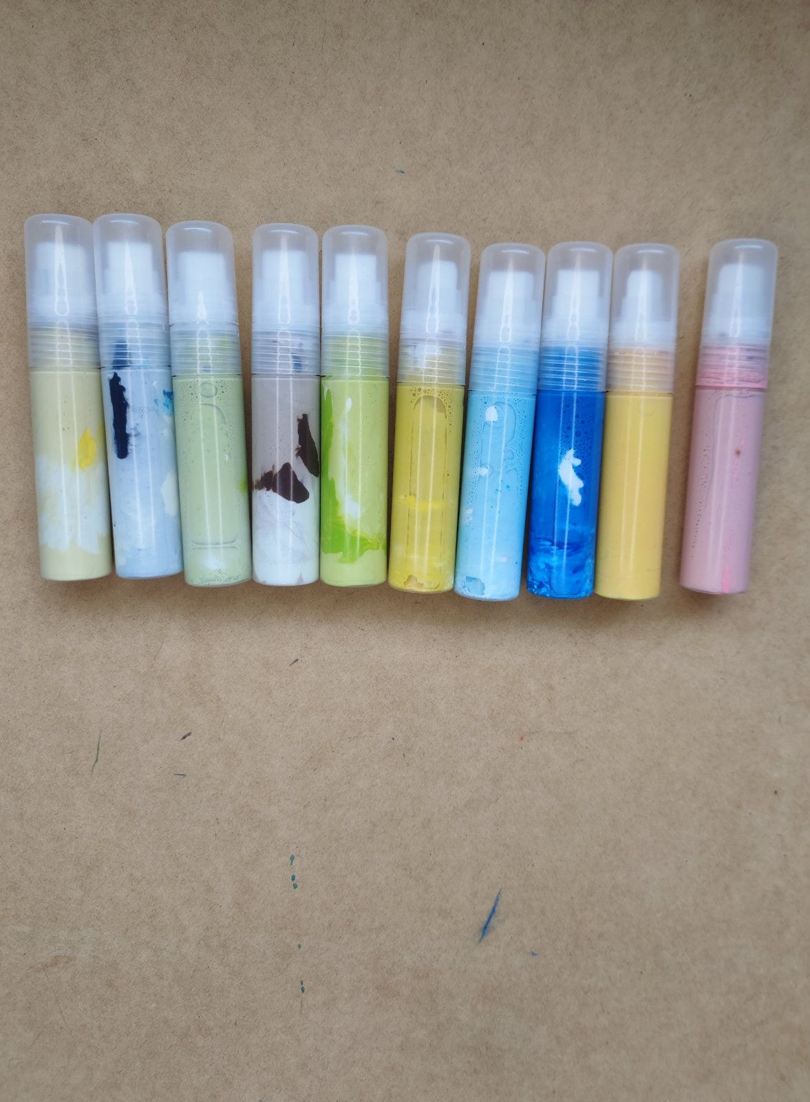
As part of this process I have also been trying to make my work set up more seamless, most especially the aspects of set up that allow paint into my work. My latest step in that direction is this set of homemade acrylic markers which are, I am finding, wonderfully adaptable. It's so great to introduce favourite premixed colours into pieces so easily. I have tried various brands of markers and although I have liked certain colours, particularly in the Liquitex range, I can't get on with most colours, and most of the nib textures I've encountered. It's just too tricky to get good clean lines and/or a variety of lines with most of the nibs. I also find the nibs wear quite quickly with certain brands which can allow for, briefly, before it is completely worn, interestingly scratchy and frayed lines. But ultimately the real dream and promise attached to a paint marker is that you can draw cleanly with pure paint.
Which is the case with these ones I bought. So far, so promising. I love being able to mix and remix my own colours and change my mind even and darken and lighten accordinly. I also enjoy the nibs in this instance thus far. The only issue I’ve had occasionally is that if the paint mixture I produce is too fluid the paint can pool a little when it first come out which, again, can have interesting effects but isn’t ideal for when you want more control. But by and large this hasn’t happened and when it has it is just an initial blot before things run more smoothly.
So an interesting experiment so far and I like that this allows me to paint on the go or on the run or whenever with pre-mixed colours of my own choosing and design. It also means I can forgo the paint markers I’ve had mixed success with so far.
II
Process Notes: On testing and re-testing materials: Coloured Pencils
Many apologies before I begin re: the art nerd aspect to this section!
I say the following really in the context of having discovered that constant and periodically renewed care and vigilance is necessary when you choose art materials for pieces you ultimately hope to sell or exhibit.
I have used a number of coloured pencils brands in the past but recently I have settled in on using only a few: Caran D’Ache Luminance and Derwent Lightfast for the most part as they are two of the most proven lightfast brands (alongside Royal Talens Van Gogh which unfortunately is not sold open stock), but also the wonderful Derwent Drawing pencils and sometimes, sparingly and selectively, Supracolor and Museum Aquarelle.
Sadly, I have put aside my formerly beloved Polychromos pencils as I have come across at least two artists’ lightfastness tests of these pencils that have produced surprisingly disappointing results. For more information on the tests in question seek out Judith Crown and Stephanie Kilgast’s lightfast tests on several brands of colouring pencils.
In both cases even the highest-rated Polychromos pencils faded after undergoing long exposure to sunlight whereas the likes of Luminance and Derwent Lightfast fared significantly better. I won’t deny I found these results very disappointing as A, I own a good quantity of these pencils by now, and B, I enjoy using them, and C, think them extremely unique re: their good qualities. I love the colour range, the way you can create glazes with them, their grain on a page and precision. So it is a shame that, according to these test results, they don’t measure up with the most modern ASTM standards, the gold standard for pencil lightfastness.
I will say this in their defence: I do wonder whether this brand’s tendency to work on the page in layers of subtle glazes works against them in lightfast tests. They do produce a much thinner first layer than many other brands which would indeed work against them in a lightfast test as in certain cases a tester might be measuring the strength of a “glaze” versus in what other brands constitutes a much thicker layer of pigment. A very rigorous future test might ensure that several layers of this pencil is being tested in each case, or a mass tone, so to speak.
Of course, these are wonderful pencils and they are certainly not the only brand to fall short in these lightfast tests (although they are arguably the most notable prestige brand to do so). And they should definitely continue to be used for illustration and other impermanent or sketchbook work.
Nevertheless, I do feel the best policy regarding these pencils, for me, and perhaps for others who want to sell their work, is to confine their use to sketchbook work for now. Until there is greater clarity on their lightfastness it might be the wisest option. And I can say this much: if Polychromos ever produced a pencil in the future adhering to ASTM standards I would definitely want to try it.
I have produced four or five original Polychromos-derived drawings that I may advertise in the future, but clearly marked with the caveats listed above about their possible lack of lightfastness. Drawings of that sort would have to be displayed out of direct sunlight and ideally behind UV-proof glass.
But I won’t be using these pencils for original work in the future with the limited exception of the few pencils in the range that actually passed the Crown and Kilgast’s lightfastness tests, and even in that case, I won’t be re-purchasing even those pencils in the future as I think it best to stick to ASTM-tested brands.
For those who might be interested the few Polychromos that fared best in these lightfast tests were the following: black (unsurprisingly), Light Ultramarine and Sky Blue (although Derwent Lightfast’s Mid Ultramarine is an almost exact substitute for the latter), Cinnamon (Derwent Lightfast’s Cinnamon again is a good substitute for this one), Venetian Red, Indian Red, Burnt Sienna, Sanguine and many greys and browns. Deep Cobalt Green was the only green I felt had adequate lightfastness based on these tests. All of the fresh summer greens became more grey toned over time or faded completely. I do love the Polychromos Prussian Blue (Luminance have a good one too) and it did well enough perhaps to salvage. The colours I have named specifically did probably the best - some of the greys and browns I haven’t mentioned were a little less impressive than I expected.
III
On Originals and ‘Five Pieces’
As I mentioned last month I will be showcasing small amounts of originals (five maximum) on Big Cartel, available via my bio in instagram (as part of my linktree) & here: Shop. The shop’s (on the nose but quite apt) title is ‘Five Pieces.’
This has come about because I want to streamline and simplify things and so have decided to focus more on my substack and this new platform going forward (alongside instagram of course).
Big Cartel is a shop in essence, of course, but really I wanted a space for originals so that they can be viewed as they appear in little showcases of current styles and interests. Although there is no option to showcase without a listed price on this platform feel free to think of this space as a miniature informal exhibition space for the moment!
At this moment you will find a little collection of very small gouache and watercolour pieces I produced on paper. All of them are botanic studies (of a sort) in paint.
My aim is to gather together little groups of related pieces for short periods (I’m thinking each miniature selection might stay on the site for a month or thereabouts or be swapped over and transition in increments across an equivalent period) - if there is ever less than five pieces on the site at any time I am still in the process of adding them so don’t sue me for mis-labelling!
My website has also been streamlined and upgraded in this period and also primarily showcases original pieces at the moment.
I have also half a mind to really streamline and focus entirely on originals on this newer platform, Five Pieces, in the future, so I will update on that in the next newsletter.
IV
Art Adjacent: On Light Cobalt Blue
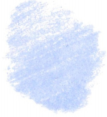
I veered between several blues of the “powder” variety whilst attempting to choose this month’s signature colour
I considered Light or Mid Ultramarine for instance, & Light Aqua, amongst other possible blues.
But there was something about Light Cobalt Blue. Of all the lighter blues it is the most translucent (in certain brands in certain medias). It has the cloudy quality of a silver blue or a silver white. It is perfect for misty horizons or anywhere on a warm or cold day where the light occludes at points. It softens other colours, mists glass like breath, adds a sheen and glimmer to surfaces, acts as a highlight amidst darks.
It is not an everyday sky blue, but the blue of the sky on a very particular day in a particular season in a particular sky. It could be the early morning in the Mediterranean or the pale mid-morning somewhere far up in the iciest parts of the Northern Hemisphere.
V Art Adjacent: On my Substack
Just a quick note that half of my past posts (or thereabouts) are now only available to subscribers.
For full access to them and to what now constitutes a fair quantity of some quite developed close readings of some of my favourite famous (or slightly less famous) paintings please consider subscribing.
Subscription is free at this time, although there is also the option to subscribe for a small fee to support my work here. And if enough people choose that option that happens I would be interested in expanding into more regular and extra content in the future.
Going forward I plan to alternate between entirely open access posts and subscriber only posts and so next month’s post will be the first subscriber only affair.
But there will still be open access posts going forward every two months for the time being and there are some from previous months still available to everyone!
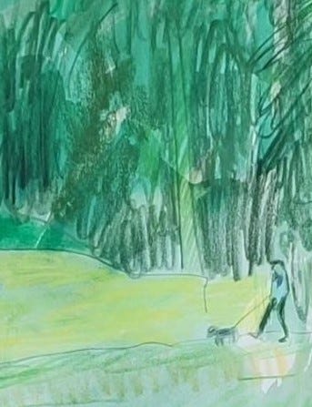
VII Process Notes: Sketch of the Month
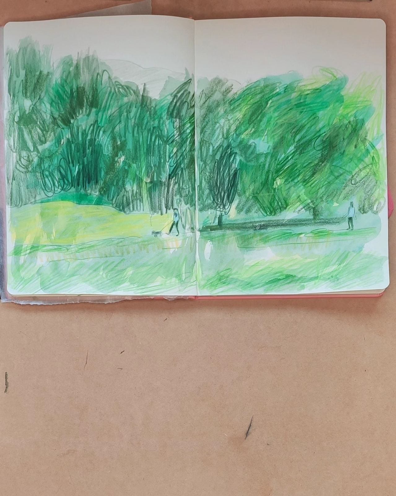
On a recent Instagram landscape (or parkscape) sketch.
Let’s call this sketch ‘Walking under Big Trees in Summer,’ 2023, watercolour and pencil, just for the sake of headlining these bullet points, and pretending that it is a gallery exhibit and this a gallery note!
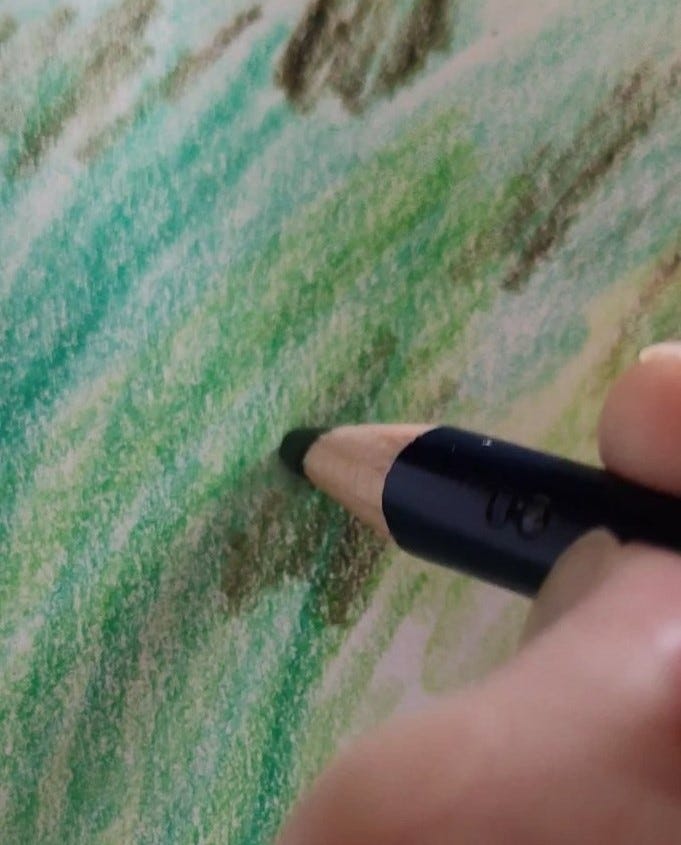
This picture was produced with watercolour and with Polychromos pencils. Yes, them! And there is a sense of why they are special and why I love them in this picture as the “big trees” in question are actually just an interwoven scribbled swirl of various green pencils against a backdrop of watercolour.
I remember when I visited London once I was taken aback at how tall some of the trees are in English parks and thought to myself that just as we are a low country with few or no large mountains and just as Dublin is a city of low buildings, we are also a nation of small trees (by and large). But since I’ve moved to a house beside the Phoenix park and am exploring a part of the park I’ve never seen before one of the greatest pleasures was walking under and through tall trees. Generous trees let’s say, with explosive canopies so that when you look at other strollers walking with their dogs they look positively miniscule, and almost entirely engulfed by green shadows. So in the spirit of celebrating the magnificence of such trees this loose drawing is really a swirl of chaotic green expansiveness.
This is, again, a mixed media piece. I like combining paint and pencil in this way although in this instance the drawing is amorphous and textural primarily. This is a study of something overwhelmingly large and complex and sometimes the chaos of that is best conveyed through unruliness!
VII
A reminder: if you have enjoyed any aspect of my monthly posts do consider liking, and subscribing to this newsletter. It would really mean a lot and help me maintain this space going forward
VII
Finally if you like my artwork and want to support its continuance you might also consider a paid subscription. It would be much appreciated so I can evolve and develop my practice. Many thanks.