


March Letter
On Acrylic Paint and a Particular Shade of Green


I
On Acrylic Paint:
I have already produced a post about gouache and shall also post in the future on watercolour, but this month I would like to reflect on acrylic paints. These are the big three paint media I have explored in the last couple of years in order to expand my repertoire.
Early in my art training I had a strong reaction against oil painting and never returned to it and when I decided to experiment in paint a few years ago I knew I would be looking elsewhere. I think in some respects I feared attempting to use paint because oil painting represented “pure” painting to me, or classical or traditional painting, and that had always seemed to be somewhat imposing.
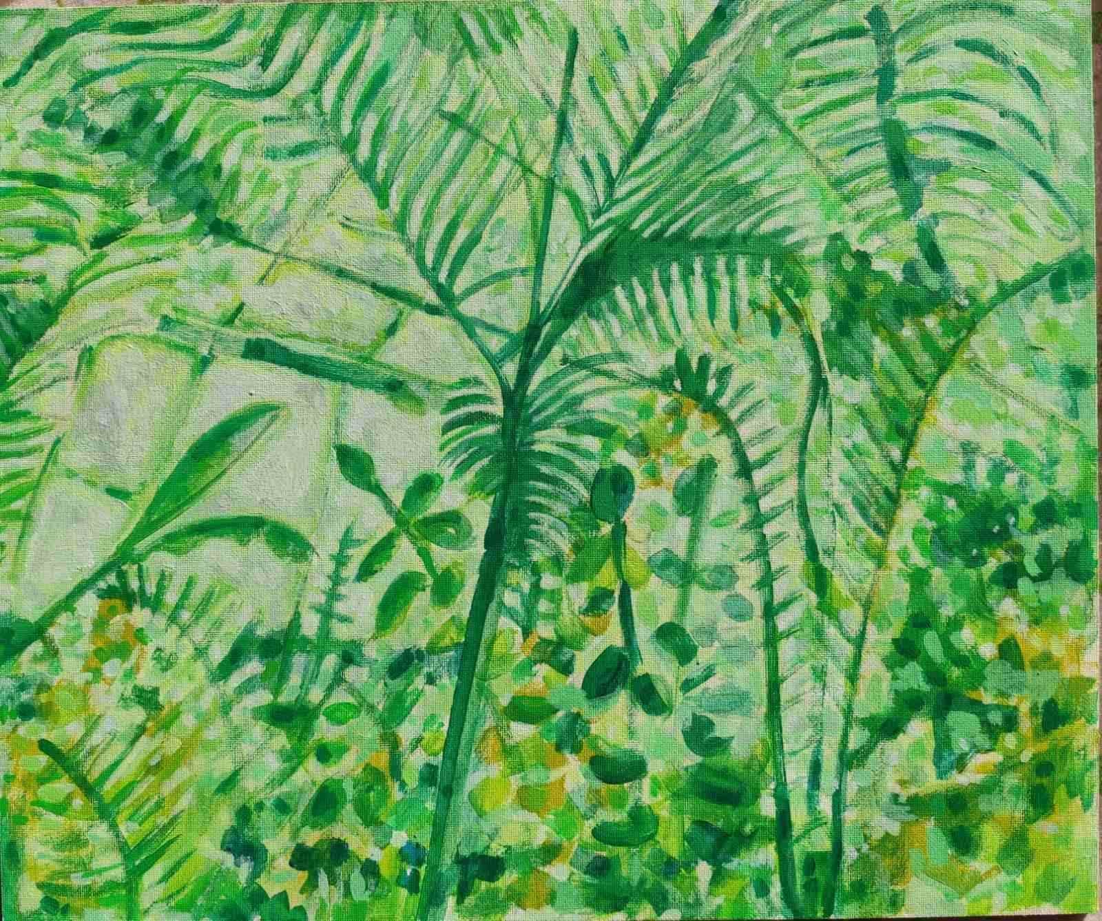
Gouache and watercolour paint have been adapted by me as more or less “mixed media” tools and so acrylic paint is the only representative in my methodology that can be considered akin to a version of my idea of “pure” painting. And in many respects it is true to say that acrylic paint is not a sketchbook or informal or everyday medium for me, at least not yet. Acrylic gouache (which is more acrylic than gouache in composition essentially) has proved to be a special case however as it falls into the category of one of the more informal media for me and so I have used it quite often for quick pieces or sketches.
In essence I suppose it is fair to say that acrylic paint is distinct from all the other media I use in many respects. So what can I say about its particularity and distinctness in relation to how I use it?
Well, it has many virtues but it is not, for me at least, a sketchbook medium, and not a quick medium (despite an often too-quick drying time). For me acrylic paint connotes serious work, slow work, considered work. And although it is not at the centre of what I do, principally because I veer between so many different media it has occurred to me that acrylic painting is most probably my artistic end game. Everything else I have done has led towards it and prepared me so I can face its unique challenges. I feel most challenged and most alert when I am attempting an acrylic paint artwork as all of my skills and knowledge must come into play in the course of creating it.
This is because there are short cuts available to the dry media artist and even in relation to other sorts of paint in relation to the colours you use but I attend most closely to colour and most especially to the complexities of colour mixing and subtle colour valuations when I am using a sophisticated medium like a good quality acrylic paint.
In the relatively small number of acrylic paintings I’ve completed so far I have spent days and in some cases weeks on each piece as the process, for me at least, is more involved and considered than a sketch or dry media piece tends to be. And although this is time-consuming and taxing I also find the problem-solving aspect of painting in this mode more fulfilling than a day of sketching on the run.
In fact I suspect sketching has been the foundation of my practise for the most part because I am trying to fit my art into my life as best I can. There is almost always time for a sketch but less often time for a painting especially a painting that might be ambitious and complicated. Whereas if I was living my perfect life I everyday I often wonder whether I would fully embrace the slow art of acrylic painting. This is most definitely an art medium for the unhurried, the contemplative, the explorer. And so, I am hoping the grand transition I am tracing currently is headed towards that supremely self-aware and fully awake art form – “pure” and unadultered (and hopefully uninterrupted) painting!
And failing that I hope I can learn to create developed paintings with the ease of my almost-daily sketchbook pieces.
II
My Acrylic Materials:
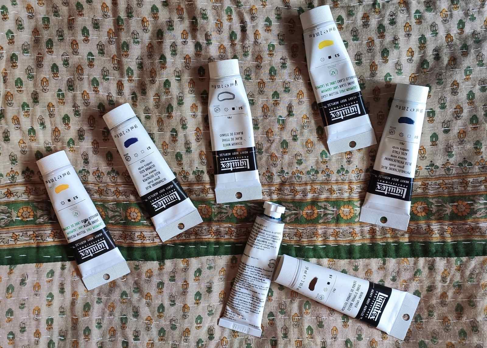
Just to give you a perspective on my highly specific acrylic process I started off using a very small very odd acrylic palette: just 8 paints and probably not the ones you would expect, three blues, one green, one white, two yellows, and burnt umber. So yes: no red, no orange, no black, no purple, no siennas. All of these bar one Golden blue were Liquitex Professional. I have since expanded with three extras: a grey, a red and an indulgence, a green.
This odd palette is the essence of how I operate. It is (for me at least) a botanical artist’s palette. Those blues and yellows of course create infinite greens and so in some ways if I was to edit it down again I would probably drop the ready made greens and actually I am using less and less white as I progress so might consider trying to operate without that too! And actually I still have never used the red so we shall see about that too.
I have recently bought a pink, sienna and ochre by Vallejo and am again curious to see whether they will find a place in how I work. And this is how things have progressed for me over time. I am still excited to try new materials from time to time but I am a creature of habit, or at least someone who likes to use what works for me and I am slower to introduce new materials into my repertoire as I have yet to establish if some of the existing paints and pencils and what not have quite earned their place as deskside staples.
And one aspect of acrylic painting I enjoy is that I use only a few materials and have discovered in the course of experimenting with them how much you can do with very little. I get slightly overwhelmed by my vast pencil collection but with these paints. There is a soothing sense when viewing my uncluttered desk.
I would be curious to know how other artists operate regarding their palettes. Does anyone else work with a small and idiosyncratic palette with notable choices (and absences)?
III
Art Objects:
Just to say I was going to attempt a reading of a more contemporary painting this month but I fear there would be copyright issues if I tried to replicate the image on my website. I think that is correct. If anyone knows better please let me know. For that reason I shall be focusing on older pictures going forward.
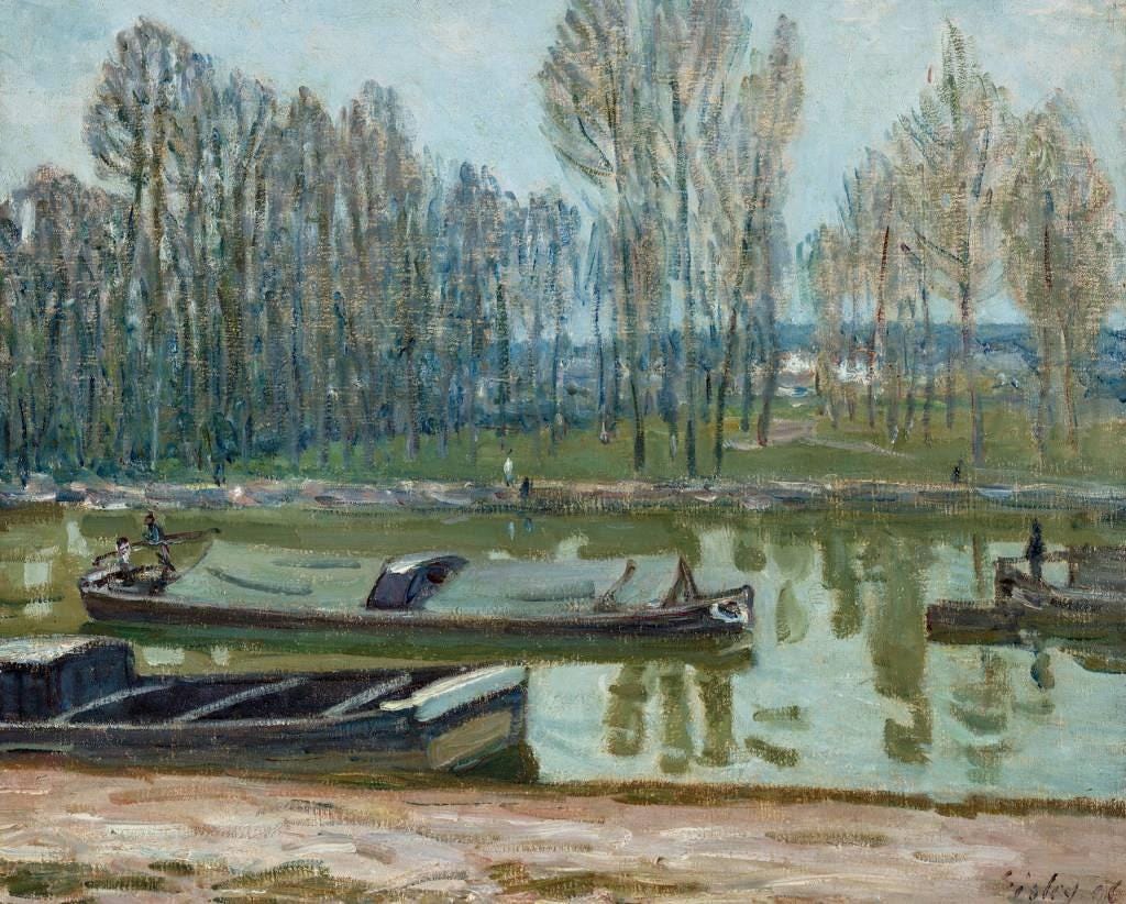
And this month’s choice is Barges from Berry on the Loing Canal in Spring by Alfred Sisley, 1896, (Oil on Canvas, 54 x 65 cm).
This month I want to just observe as opposed to producing a more detailed contextual reading so I am just going to pay attention to what appears notable to me in this painting.
Like Monet last month we have in Alfred Sisley another water-obsessed artist – in this case the artist tended in his obsession towards canals and rivers as opposed to the ocean. The smoothness and sedateness of the brush strokes in the rendering of the river and barges is well-judged in this painting – the painting is grounded by this. This smoothness can seem a little stiff at first although when you look carefully there is a looseness to aspects of the water: particularly the blocking of the tree’s reflections.
The colour of those reflections and of the grass on the opposite banks is one of the most distinctive and alluring aspects of this painting. Sisley has chosen, in this instance, a very particular and curious green. I am fascinated by how certain artists in certain paintings discover uniquely evocative or memorable colours. This shade of green is one of those colours.
This is a spring painting but the green Sisley has chosen is not an obvious colour to apply in a depiction of the springtime. Nevertheless, the longer you sit with it the more true it feels to the complexity of the season (or of any season) and the possibilities of light and shade on a day under Sisley’s soft grey-blue sky. Sisley’s green might be termed a late winter green and/or a very early spring green. There is a chill to it and a muddiness to it but also a slightly subdued freshness that promises the spring to come more than it advertises its already accomplished arrival.
The other notable aspect of this painting is its background. This is a painting with a solid but also a flattened and almost motionless foreground but its background is much more compelling: barely sketched, beige-pink poplars shiver on the other side of the river like a mist.
And although the background of this painting is rendered in a more diffuse, loose and sketch-like way than the foreground it feels as though this is where the eye is meant to go, and where Sisley compels you to look.
There is a yearning in this painting for the other side of the river and for whatever season exists there whether it is the winter that was, or the spring to come or both. In this composition you look past and through the quotidian, the everyday, the listless barges and the lacklustre nearer banks, and at what is far and indistinct but also lit by a cold fresh green and the vibrant uprightness of arcades of semi-nude spring trees.
IV
A reminder to check out my website shop at davidmonteiroart.com. Or follow the link in my instagram bio. I have a good number of prints available – some landscape, some botanic, some animal. Details of my printer supplier is featured with each listing.
UK and EU deliveries are custom free, and best of all deliveries are free in every area I currently deliver to: the EU, the UK, the US and Canada.
Also please do check out the small but slowly increasing collection of originals I’ve been adding to my website store over the last few weeks.
V
This newsletter will continue on a monthly basis (with occasional extras here and there when relevant). In the mean time if you are reading please subscribe to the monthly newsletter and if you want to buy me a coffee on Ko-fi at this link (https://ko-fi.com/davidmonteiro) it would be much appreciated so I can evolve and develop my practise. Many thanks.