


Pine & Juniper Letter:
On working with paint on its own, on "finished" and "unfinished" pieces, on a photo of an artist in their studio, & on Pine & Juniper.

I
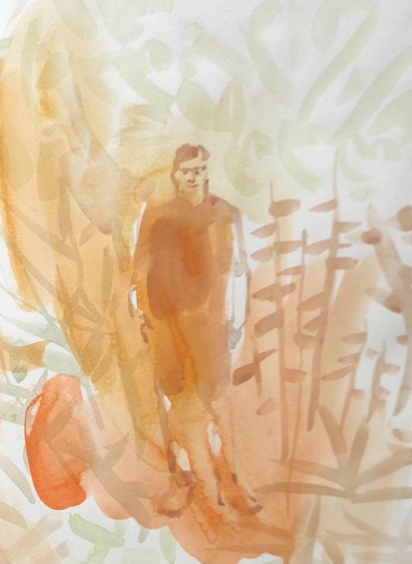
Art Process: On working with paint on its own
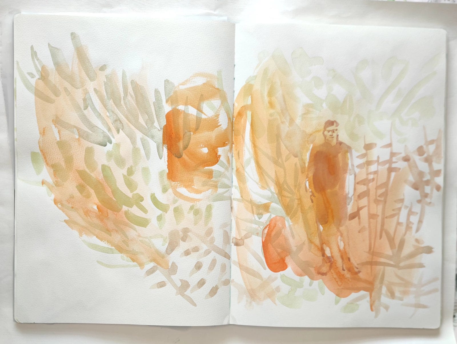
This might seem an odd take to paint purists but for those of us who approached paint via mixed media it is worth saying this: paint on its own is an adjustment.
And in this period of working in watercolour I have been firm on one point. I won’t mix it up with other media. There are, of course, practical reasons for this as rough or cold press paper is unforgiving for other media (and some would say for paint too!). It isn’t ideal to use an acrylic marker or even a coloured pencil on scratchy, textured paper.
But even beyond that I have noticed in myself and other mixed-media artists this tendency to put down a base layer in paint and then finesse with dry media on top of that. And that is fine and something I have done but I wanted to test myself. Could I achieve what I wanted without that finessing and without that insistence on the sorts of fine detail that can be achieved with a layer of dry media? And so far I see it as a welcome challenge and opportunity. Some of the effects that can be achieved with paint alone are unique and there is something fresh and immediate about the ultimate effect, detail or no detail.
I mean to say I can get fine detail to an extent. I do possess fine detail brushes but as time has gone by in this experiment and as I have learnt to embrace and better understand the qualities and virtues of this medium I have realised that detail isn’t always required and in fact can restrict or inhibit. Or at least too much detail. A tiny bit of detail can be a nice counterbalance to hyper-expressiveness elsewhere.
And so although I miss my beloved pencils for now while I work on the more textured types of watercolour paper I won’t be reaching for them. When I am working on the smoother types of hot press paper I might as they can work well in that context.
And so I would say this: if your art practice involves paint as a base layer and then typically proceeds via dry media perhaps it might be an interesting experiment to see where a piece might go if you just use paint. Where does that path lead?
II
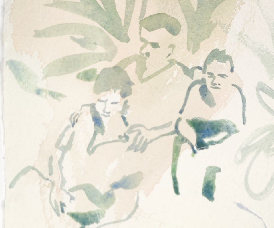
Process Notes: On “Finished” and “Unfinished” Pieces
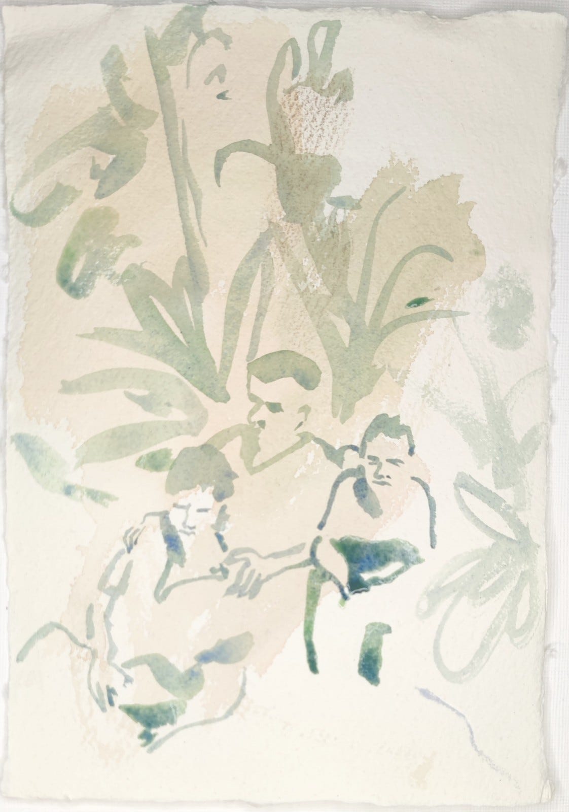
Following on from this point I will say that working in paint can challenge the mixed media artist’s conception of a “finished” artwork.
I know of other artists whose signature is their “professional finish” which can create a standard and idea of a “finished’ piece that doesn’t quite marry with how other artists might work. And I know that at least some of the time (and certainly in this loose watercolour period) I don’t adhere to that particular standard, but I also don’t mind.
I find that most of the standards of painting technique that might relate to watercolour (and other types of paint and indeed other types of dry media) are very much founded on the supposition that you intend to produce figurative and/or traditional art. The artists offering tips and tricks out there tend to be traditional artists with a classic approach to landscape or portraits or whatever it might be. And although their perspectives may be valuable in certain respects they are not going to suit every artist (especially those who want to find their own way without tips or tricks).
And so with that in mind I will add that for me watercolour is about expression and creating painterly atmospheres. Sometimes I aim for a print-like effect and lay semi-transparent glazes as though I were putting down layers in a print and sometimes I work very loose (again often with transparent glazes). Either way I am leaning into the possibilities that excite me about the medium: print-like or fuzzed-up atmospherics or loose calligraphic effects.
So instead of worrying about whether your approach is too “finished” or “unfinished” looking, or too “tight” or “loose,” or too “traditional” or “experimental,” or whatever categories you might be wrestling with, I would say this: forge your own relationship with the mediums you choose based on the effects you prefer and want to achieve and judge your work on those terms.
III
Art Objects: A photo of David Hockney working in his studio.
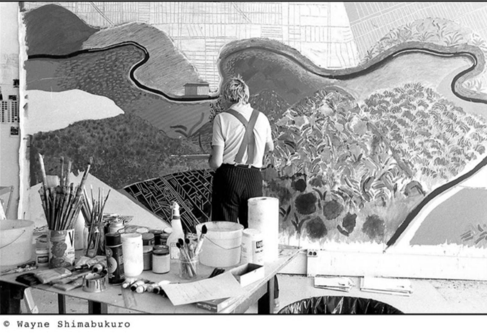
Something different this time as I am interested not so much in this painting in process by David Hockney (in this case “Mulholland Drive: The Road to the Studio,” 1980, acrylic on canvas) so much as the photo of this painting in process (and of this artist at work in his studio). The painting itself is wonderful and worthy of an analysis in itself but perhaps another time!
Christopher Isherwood called Hockney “Mr Whizz” as he was quite the workhorse during his early California phase (and ever since really). And so here is Mr Whizz in his studio working on a rather immense canvas!
I love this photo for a few reasons. The behind the scenes glimpse of Hockney at work. The glimpse of this painting at this early stage: the exhibited picture is different in some respects, and it is interesting to observe those differences.
But, ultimately, in this era of art materials obsession, I would direct your attention towards Hockney’s table loaded with paints and brushes and other oddments and most particularly the half-discernable label of a well-known brand name. You can just about see the name “Liquitex” attached to the jar of medium or paint at the furthest edge of the artist’s table.
I have written before about my curiosity re: art materials and their provenance and history. It is interesting to know that some of the materials we might use (and take for granted) are quite old whereas others are very recent. So jostling together in our studios and jars and desks are variably-historied items. So the Faber Castell Polychromos pencils date back to 1908 whereas what are considered throughout instagram to be their fiercest rivals, the Caran D’Ache Luminance 6901 pencils, appeared a century later in 2008! And the most recent contender in this field, the Derwent Lightfast pencil, derived from a company founded in 1832, only appeared in the last few years.
Materials are storied and historical and I feel this matters as much as the history of pictures especially if you are an artist and you operate behind the scenes just as much as “front of house”.
Oil painting is almost as old as painting itself or at least as old as the sort of painting we see represented by the formal western history of painting. But acrylic is, relatively, a very young medium and has only been used by artists in any significant way in the last sixty years. Hockney has consistently been open to embracing new technologies into his art practice, whether it be the Fax machine or the IPAD, and so it unsurprising that he was one of the artists who immediately leapt into using this new painting medium from the 1960s onwards.
This photo is from later, depicting a painting in process from 1980, and so Hockney had by now established a twenty year or so relationship with the medium (and perhaps the brand too). It is my understanding that Liquitex was the definitive artist-grade brand of acrylic paint from its inception and so the brand too is significant. And so it might be argued that there is a cultural shift moment indicated in this photo of Hockney at work in his studio, with Liquitex on his desk. The supremacy of oil painting had been challenged twenty years or so previously and a champion of this new medium is seen at work, producing a major work.
It is a cultural shift as acrylic was and is as much a new pictorial technology as the IPAD or AI. It was plastic (literally), quick drying, permanent. And we still don’t know where it will lead as a medium of the future, as for instance, its claims to lightfastness and permanence remain untesting across centuries, unlike oil paint.
I lean towards acrylics and in fact can’t abide oil paint (to use for myself, I like looking at other people’s oil paintings) and shall discuss next time the problems surrounding certain “high-maintenance” mediums. But I’ll conclude by saying I am one of many artists who holds out hope that acrylic has staying power as it is clean, efficient and vibrant.
Is that Liquitex I spy?

IV
Originals
I will be periodically showcasing small amounts of originals (five maximum) on Big Cartel, accessible via my bio in instagram (as part of my linktree) & here: Shop.
And if you are interested in pictures not currently listed I can add them to the store.
V
On Pine & Juniper
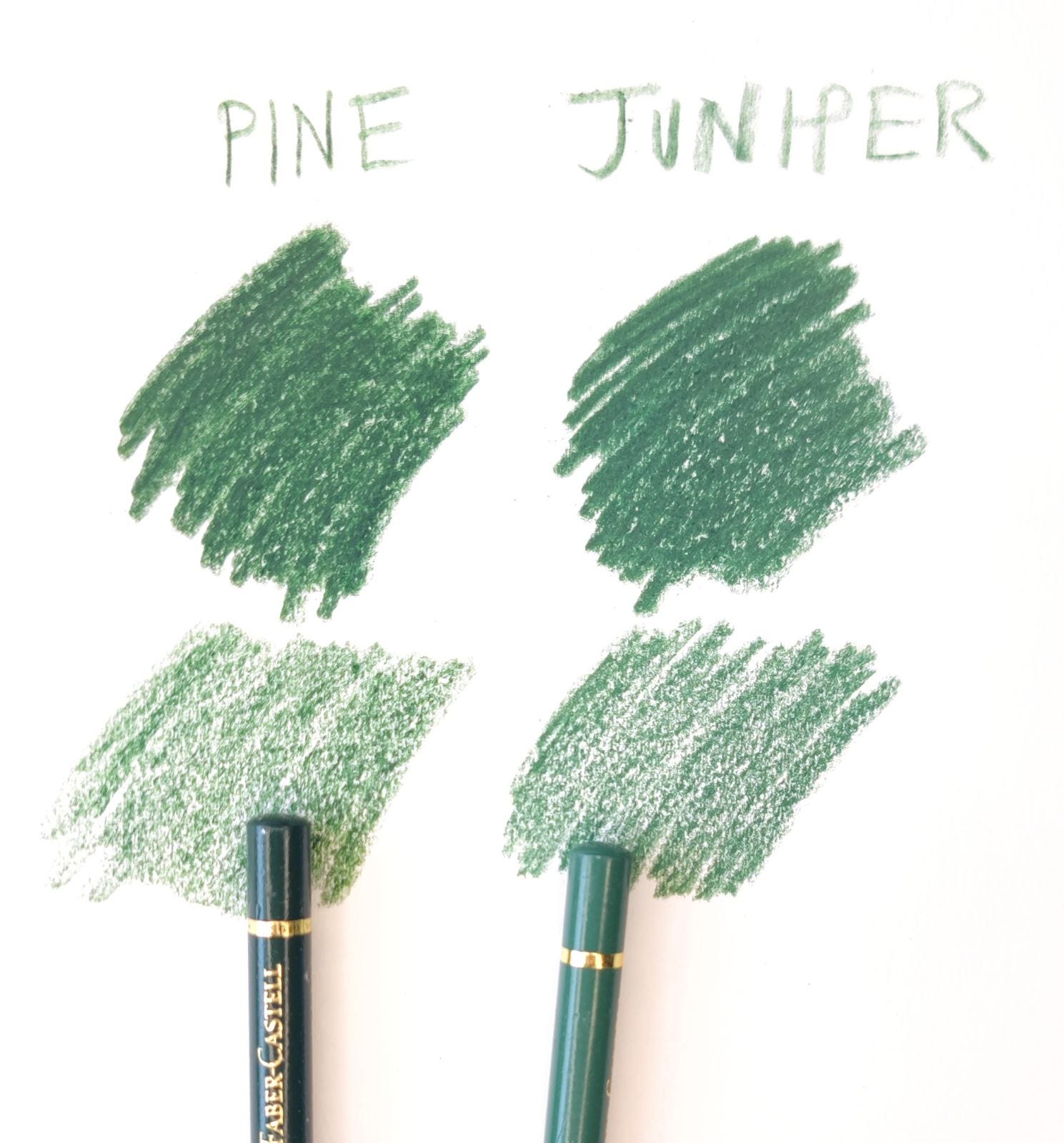
Again my starting reference point for these colours is having encountered them in my art materials, to be specific, as two of my favourite Faber Castell Polychromos greens, both of which might be termed grey greens of sorts, pine being a sort of dark-toned phtalo-tinted grey and and juniper a mid to dark toned ashy green.
Although I am in uncertain territory describing these colours both in relation to these two pencils and more generally as at times I find them indistinguishable and in some ways the mystery of how to distinguish them at certain moments is why I pair them together and why they attract my interest (and eye).
As you can see the colours of the pencils’ barrels are different - Juniper is much lighter and on the chrome spectrum whereas Pine is a very dark green. But when swatched in mass tone they are very similar and looking at them myself and consulting others I encounter different theories of which might be darker or lighter. Is Pine darker with a yellow undertone? Is Juniper lighter with a blue-grey cast? It is a bit hard to say. And to complicate things further when swatched in light layers or glazes they seem different again.
Colour can be tricky and elusive and once again, whilst looking into these colours I am struck by the many versions of a colour that can exist. And so there are Pine and Juniper colours taken from nature, then the established version of what they are in terms of man-made products like house paint, then the manifold versions of what they are in multiple art media from pencils to oil paints and so on. And which is the real or the definitive version of either and does it matter?
I note that the traditional take on Pine is that it is a dark “earthy’ green and that Juniper is a “dusty” “bluish” variant of “emerald” green. In this last year or so of considering colours month by month I have been struck by how unfixed and provisional and personal a sense of colour can be, whether they are “historical” or otherwise. And how do we distinguish the colours of this forest of correspondences from the colours of these particular trees?
With a sense of context I suppose, specifically the context of how they will be used and what their purpose, artistic or otherwise, might be.
VII
A reminder: if you have enjoyed any aspect of my monthly posts do consider liking, and subscribing to this newsletter. It would really mean a lot and help me maintain this space going forward
Finally if you like my artwork and want to support its continuance you might also consider a small paid subscription. It would be much appreciated so I can evolve and develop my practice. Many thanks.